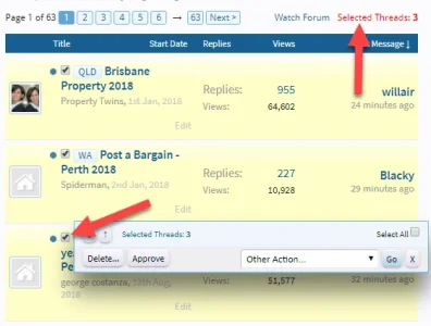
On XF 2.0 the moderator menu is way down the BOTTOM of the page. On a high resolution monitor - this is a really bad place for it, especially when the assumption is that the content being moderated is likely fairly new and thus at the TOP of the page. It would be even worse if you use a high resolution monitor in portrait mode (I know a few people who do this because they create a lot of content and it's ideal for editing documents).
Yes, it works well enough on mobile (not so great on a tablet though) - but it is a really really bad idea on desktop.
Some examples:
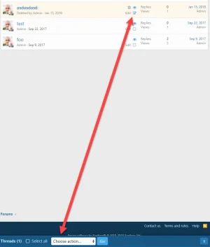
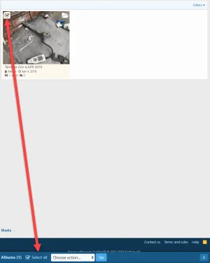
This is a huge usability issue and the argument I hear from developers who do this is for "consistency" between devices.
I don't buy that argument - the UI on mobile is fundamentally different to the UI on desktop. Hobbling the user experience on desktop for the sake of some perceived notion of consistency is a false economy because they simply aren't the same user interface to begin with.
Given the vast majority of moderator actions are likely to occur on desktop devices, please don't hobble the desktop UI or make it less efficient to do my job.
My bookkeeping software made changes to their UI system using the same argument "consistency", yet I know very few people who do their bookkeeping on a mobile device or tablet - the vast majority use a desktop, so all they've managed to is make it more difficult for the majority of people to use their app in order to appease some misguided notion of "mobile first".
Interestingly, I'm even finding a trend away from mobile devices on my sites - after peaking at around parity between mobile and desktop usage (44% each) earlier last year, both of my sites are now seeing an increase in desktop usage, as much as 50% desktop vs 40% mobile. This has stabilised for the past 6 months, so I'm thinking we may have reached a level of equilibrium and the continued trend of increasing mobile usage is not ongoing. Naturally, the ratios for some types of websites would be a lot higher on mobile - but both of my forums (one Australian centric, the other with a global audience) are seeing similar trends.
I would urge you to reconsider throwing out decades of good user interface design practices by placing an important menu at the bottom of the screen on desktop devices.
Yes, it works well enough on mobile (not so great on a tablet though) - but it is a really really bad idea on desktop.
Some examples:


This is a huge usability issue and the argument I hear from developers who do this is for "consistency" between devices.
I don't buy that argument - the UI on mobile is fundamentally different to the UI on desktop. Hobbling the user experience on desktop for the sake of some perceived notion of consistency is a false economy because they simply aren't the same user interface to begin with.
Given the vast majority of moderator actions are likely to occur on desktop devices, please don't hobble the desktop UI or make it less efficient to do my job.
My bookkeeping software made changes to their UI system using the same argument "consistency", yet I know very few people who do their bookkeeping on a mobile device or tablet - the vast majority use a desktop, so all they've managed to is make it more difficult for the majority of people to use their app in order to appease some misguided notion of "mobile first".
Interestingly, I'm even finding a trend away from mobile devices on my sites - after peaking at around parity between mobile and desktop usage (44% each) earlier last year, both of my sites are now seeing an increase in desktop usage, as much as 50% desktop vs 40% mobile. This has stabilised for the past 6 months, so I'm thinking we may have reached a level of equilibrium and the continued trend of increasing mobile usage is not ongoing. Naturally, the ratios for some types of websites would be a lot higher on mobile - but both of my forums (one Australian centric, the other with a global audience) are seeing similar trends.
I would urge you to reconsider throwing out decades of good user interface design practices by placing an important menu at the bottom of the screen on desktop devices.
Upvote
17
