commercial version started and have added in what's new,
this will show the latest files and the latest comments added.
Please remember to add alerts to author on comments on his / file (with an option to opt out) in the commercial version.
Thanks.
commercial version started and have added in what's new,
this will show the latest files and the latest comments added.
Please remember to add alerts to author on comments on his / file (with an option to opt out) in the commercial version.
Thanks.
")

its working fine now after the update
just one problem, cant add more than 3 sub categories - any reason for this?

This is purely constructive criticism so hopefully your one of those that embrace that and take things as constructive evolving to better the product.
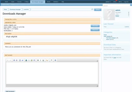
Personally the area (highlighted below) the layout looks tacky with margin and padding issues and location of some elements looking out of place and feeling rather inconsistent.Take from the screenshot what you will but i personally think there is room for a vast improvement to the layout in that area.
When a download is created, is contestually created a thread*, too?
* like the Resource Manager
so you want it to make a new thread every time you add a new file.
This is purely constructive criticism so hopefully your one of those that embrace that and take things as constructive evolving to better the product.
Personally the area (highlighted below) the layout looks tacky with margin and padding issues and location of some elements looking out of place and feeling rather inconsistent.Take from the screenshot what you will but i personally think there is room for a vast improvement to the layout in that area.
looks good. is it possible to make the font in categories a little larger?does this look better to you
I think that looks better, especially the download button.
In the same vein of offering constructive criticism for this fantastic add-on, I would like to see some styling/layout changes to the main downloads page- something like this:
http://www.surreyforum.co.uk/directory/
The point being a more attractive option for viewing all downloads.
looks good. is it possible to make the font in categories a little larger?
does this look better to you

Sounds great.intergrated search into xenforo search engine
Sounds great.
I'd love to know how hard it was.
I also think the categories block is needed as you said for quick linkingon the view file page i will remove the avata at the top and remove the categories block but i beleave the categories block should be there as its like a quick link to other files in these categories.
Imho the quick Links as to be related to the other author's/uploader's files.
A block listing the other files from this author/uploader for example.
If I want to see categories I will go in the main page (landing page) of MicroDownloads.
Another block related to the files could be "users who download this file downloaded also these files:"
Or for example give the possibility to toggle on or of off side block in the options of the addon so admin can choose whatever he/she likes to be in there.
We use essential cookies to make this site work, and optional cookies to enhance your experience.