MicroDownloads [Deleted]

commercial version started and have added in what's new,
this will show the latest files and the latest comments added.

Please remember to add alerts to author on comments on his / file (with an option to opt out) in the commercial version.

Thanks.
 
Please remember to add alerts to author on comments on his / file (with an option to opt out) in the commercial version.

Thanks.

already added in alerts for comments to file owners.
added in whats new
just sorting out the search for it now.

have also added in choose multipul usergroups when adding a file within admincp
will also add this to user side.
 
its working fine now after the update

just one problem, cant add more than 3 sub categories - any reason for this?

WNca
 
This is purely constructive criticism so hopefully your one of those that embrace that and take things as constructive evolving to better the product. :)

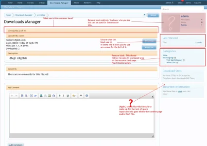
Personally the area (highlighted below) the layout looks tacky with margin and padding issues and location of some elements looking out of place and feeling rather inconsistent.Take from the screenshot what you will but i personally think there is room for a vast improvement to the layout in that area.

downloads_viewdownload_shell.webp
 
its working fine now after the update

just one problem, cant add more than 3 sub categories - any reason for this?

WNca

goto the downloads settings and you can change that from there.

This is purely constructive criticism so hopefully your one of those that embrace that and take things as constructive evolving to better the product. :)

Personally the area (highlighted below) the layout looks tacky with margin and padding issues and location of some elements looking out of place and feeling rather inconsistent.Take from the screenshot what you will but i personally think there is room for a vast improvement to the layout in that area.

yes you are right i will address this and get an update out without the images and more the date added to under where the author is.
This has only been released a short time and yes i take every idea on board and value your input.

When a download is created, is contestually created a thread*, too?

* like the Resource Manager

so you want it to make a new thread every time you add a new file.
 
This is purely constructive criticism so hopefully your one of those that embrace that and take things as constructive evolving to better the product. :)

Personally the area (highlighted below) the layout looks tacky with margin and padding issues and location of some elements looking out of place and feeling rather inconsistent.Take from the screenshot what you will but i personally think there is room for a vast improvement to the layout in that area.

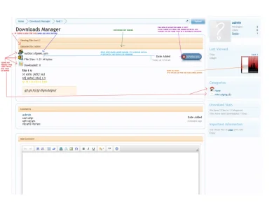
does this look better to you
 

Attachments

  • newviewfile.webp
    newviewfile.webp
    39.8 KB · Views: 26
I think that looks better, especially the download button.

In the same vein of offering constructive criticism for this fantastic add-on, I would like to see some styling/layout changes to the main downloads page- something like this:
http://www.surreyforum.co.uk/directory/
The point being a more attractive option for viewing all downloads.


Dorry i dont like this look of that it looks like alot of blocks with just text and its not layed out very well.
 
intergrated search into xenforo search engine
added top contributors
added share this page twitter/facebook
added watch this file user gets alerts on updates
added alerts for new comments
added whats new will show new files and new comments

Changed the cattegory images no images will show till you add one
Changed layout to view file as well.

these are for the commercial version that will be coming out within the week.
 
does this look better to you

It's looking better than what it was but TBH it's still looking awfully (layout wise) inconsistent and the sideblocks really don't give you info about the resources like (that authors other resources they submitted) . Download stats block is a waste of a block and space just to know <resource> has been downloaded so many amount of times. I would personally make the watch button link text but that is preference on my part.

Overall and only my opinion I find the whole release page (most important page of th resouce/download add-on) is untidy with info scattered here and there and sideblocks add to fill in the gaps just to make up the space. This is no way knocking you as a devloper I'm sure judging by your other add-ons they are greatly coded but layout it's not great.

newviewfile_shell.webp
 
on the view file page i will remove the avata at the top and remove the categories block but i beleave the categories block should be there as its like a quick link to other files in these categories.

The container at the top is to let you know what file you are viewing but i could put this abouve the author and remove that container.
Last viewed can also be removed from the view files page as the last viewed would be the file you are viewing.
 
on the view file page i will remove the avata at the top and remove the categories block but i beleave the categories block should be there as its like a quick link to other files in these categories.
I also think the categories block is needed as you said for quick linking
 
Imho the quick Links as to be related to the other author's/uploader's files.
A block listing the other files from this author/uploader for example.
If I want to see categories I will go in the main page (landing page) of MicroDownloads.
Another block related to the files could be "users who download this file downloaded also these files:"

Or for example give the possibility to toggle on or of off side block in the options of the addon so admin can choose whatever he/she likes to be in there.

some of what you are asking for are being added to the commercial version.
For this version if you dont want some of these blocks to be added just remove them from the templates where you dont want them.
I do understand what you are asking for and most of these things will be added to the commercial version only.

As you will see with most coders they release a lite version for free to get you interested and give feed back on it.
 
Top Bottom