Grover
Well-known member
I agree with some of the sentiments/feedback that has been given here:
https://xenforo.com/community/threads/rework-the-flow-layout-and-phrasing.86906/
With the Xenforo forum product everything is completely clear from the first time you start to use the product. It has a truly outstanding UI (and therfore UX), compared to other forum products on the market.
One can see that the XFMG is a separately developed product, since in some parts one misses the consistency with the (again: outstanding) UI of the main forum product. I assume overtime this will be fixed, now the XFMG is an official product that needs to fit in with the overal UI experience.
One of these things is this: the lightbox icon.
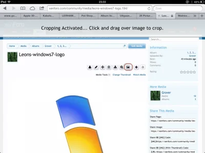
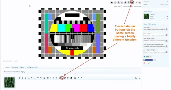
Here you see it presented in the XFMG to the enduser as an [Image] icon: clicking on it actually opens a lightbox instead of an [Image] insert dialogue, which you expect seeing such a button.
We expect this, partly because the main XF forum product uses almost the exact same icon for exactly that purpose. As you can see here in the editor:
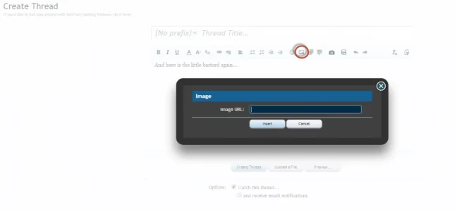
Bottom line: for consistency reasons and making the (already quite convultated) XFMG interface a bit less confusing the suggestion would be to change this icon in the XFMG interface.
https://xenforo.com/community/threads/rework-the-flow-layout-and-phrasing.86906/
With the Xenforo forum product everything is completely clear from the first time you start to use the product. It has a truly outstanding UI (and therfore UX), compared to other forum products on the market.
One can see that the XFMG is a separately developed product, since in some parts one misses the consistency with the (again: outstanding) UI of the main forum product. I assume overtime this will be fixed, now the XFMG is an official product that needs to fit in with the overal UI experience.
One of these things is this: the lightbox icon.

Here you see it presented in the XFMG to the enduser as an [Image] icon: clicking on it actually opens a lightbox instead of an [Image] insert dialogue, which you expect seeing such a button.
We expect this, partly because the main XF forum product uses almost the exact same icon for exactly that purpose. As you can see here in the editor:

Bottom line: for consistency reasons and making the (already quite convultated) XFMG interface a bit less confusing the suggestion would be to change this icon in the XFMG interface.
Upvote
2
