Grover
Well-known member
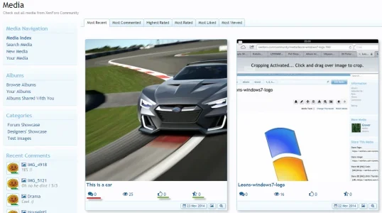
When you look at the 4 icons that are displayed under the images in the media overview:

... we can click the Like icon, we can click the Rating icon and for obvious reasons not the View button. But I was wondering: why not also make the Comment icon clickable, so it transports the enduser straight to the comments section of the image?
At the moment, when we want to see the comments on an image, we have to click the image and in the image-screen we need to scroll down to see the comments. A clickable comments-icon in the media overview could transport us to the comments area directly, without us having to scroll to it. One could even opt for making 'write a comment' active, so the enduser is presented with a blinking cursor there to dive straight into the commenting process.
Maybe there is a good reason/thought behind not making the comment-icon clickable, but if there is not, then it is worth considering.
Also, because you know on an iPad you actually can not see which of these 4 icons (Comments, Views, Like, Ratings) is clickable. Since there is no mouseover (with hand/underline indicators) available, only with trial and error one finds out which of these 4 icons is clickable. If one extra is clickable, then it's more clear we can use all of these icons, except the Views one.
Upvote
1