Grover
Well-known member
As I said before I agree with some of the feedback being given here about the UI/UX of the new XFMG product.
Let me then give some specifics. I agree for instance with that interacting with the media is not always so clear/intuitive in XFMG. For me, the majority of the 'issues' on this level have to do with the buttons:
For example the use of the 'image' button for different purposes.
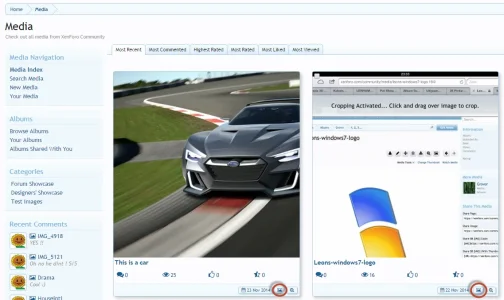
Look at this screen:

In this screen, the 'image button' is used as an indicator for images. It doesn't do anything if you click on it (which in itself is a bit confusing, since it is styled as a button).
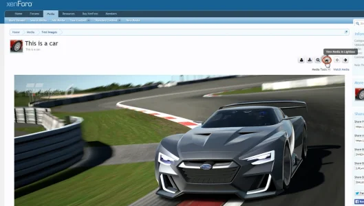
And then look at this screen:

In this screen, the exact same icon is used, but for a totally different function: when clicking it, it opens your image in a lightbox.
2 totally different functions using exactly the same icon. This is no good for obvious UI/UX reasons.
... and interact with current media is not all that easyobvious for them. Again I don't have specifics...
Let me then give some specifics. I agree for instance with that interacting with the media is not always so clear/intuitive in XFMG. For me, the majority of the 'issues' on this level have to do with the buttons:
For example the use of the 'image' button for different purposes.
Look at this screen:

In this screen, the 'image button' is used as an indicator for images. It doesn't do anything if you click on it (which in itself is a bit confusing, since it is styled as a button).
And then look at this screen:

In this screen, the exact same icon is used, but for a totally different function: when clicking it, it opens your image in a lightbox.
2 totally different functions using exactly the same icon. This is no good for obvious UI/UX reasons.
Upvote
0