Grover
Well-known member
I agree with some of the sentiments/feedback that has been given here:
https://xenforo.com/community/threads/rework-the-flow-layout-and-phrasing.86906/
One of it is:
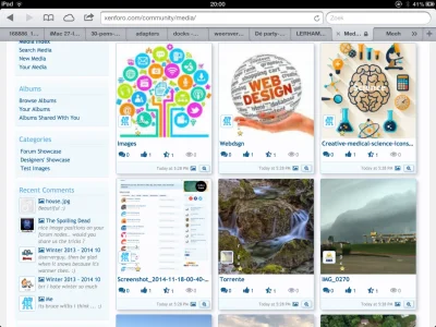
I myself do also experience 'issues' with the 3 little 'buttons' at the very bottom of an image in the media overview. Or some of the other icons/buttons in general (see my other recent suggestions about these and this former issue) in the XFMG.
With the Xenforo forum product everything is completely clear from the first time you start to use the product. It has a truly outstanding UI (and therfore UX), compared to other forum products on the market.
One can see that the XFMG is a separately developed product, since in some parts one misses the consistency with the (again: outstanding) UI of the main forum product. I assume overtime this will be fixed, now the XFMG is an official product that needs to fit in with the overal UI experience.
The XFMG shows quite a few buttons beneath every picture/video, making the UI in this overview a bit convoluted. Something (the UI being not that clear/clean) we are/were not used to see in XF the forum product, which has a truly outstanding UI.
Some points I would like to share:
Here are the screenshots:
Current state:

Suggested changes:

https://xenforo.com/community/threads/rework-the-flow-layout-and-phrasing.86906/
One of it is:
... and interact with current media is not all that easyobvious for them.
...the corresponding tiny icons and make those bigger too...
I myself do also experience 'issues' with the 3 little 'buttons' at the very bottom of an image in the media overview. Or some of the other icons/buttons in general (see my other recent suggestions about these and this former issue) in the XFMG.
With the Xenforo forum product everything is completely clear from the first time you start to use the product. It has a truly outstanding UI (and therfore UX), compared to other forum products on the market.
One can see that the XFMG is a separately developed product, since in some parts one misses the consistency with the (again: outstanding) UI of the main forum product. I assume overtime this will be fixed, now the XFMG is an official product that needs to fit in with the overal UI experience.
The XFMG shows quite a few buttons beneath every picture/video, making the UI in this overview a bit convoluted. Something (the UI being not that clear/clean) we are/were not used to see in XF the forum product, which has a truly outstanding UI.
Some points I would like to share:
- We have 7 icons displayed under each picture. Quite a lot. The upper 4 (comments, views, likes, ratings) all share the same style, but with only 2 of them (likes, ratings) we can interact. In the beginning of using/testing this product I found myself pressing/touching the comments and views icons, but unlike the likes and ratings icons they do not respond. On a desktop this is more clear, since the icons have tooltips and an underline when you can interact with them. But on an iPad these tooltips are not there and the underline only displays the moment you press the icon (since there is no mouse-over)
An idea could be to make the Comments icon also clickable, so when you press this icon, it brings you to the comments area of the specific media item, gaining more interaction from the forum users. Then 3 of the 4 icons are clickable and then maybe the Views icon can be 'grayed out/lightened up' a bit, so it distinguishes itself from the rest of the 3 buttons and it's more clear this is not an interactive button like the rest of them. And, when you re-order them and put the only non-clickable one all the way to the right, you always know which one can not be clicked. You group the clicable ones together.
(Edit: see this separate suggestion about it: https://xenforo.com/community/threa...ttons-make-the-comments-icon-clickable.87772/) - Then, below these 4 icons we have 3 'icons' that actually look like buttons: the date, the image/video-indicator and the preview/play button. I wonder: what is the reason these icons look like buttons, when actually 2 of the 3 can not be clicked? Only the preview/play button is actually an action button. The other two share the same button-style, but turn out not to be buttons. In the beginning of using this product I found myself clicking on the date-button for example, without any effect. That brings me to the point of how XF - the main forum product- displays the date in other areas of the product. Throughout the whole product it is styled differently compared to XFMG: not contained in a 'button' and it actually displays the 'live' date like: Today at 7:44 PM instead of [17 Nov 2014], which also includes an seemingly unnecessary calendar-icon (when one displays a date it's clear that it is a date, an calendar-icon is redundant info then). It would be more consistent I guess to display the date in the same way XF main forum does it and therefor also lessen the amount of 'buttons' on that overview.
- In the Recent Comments section one can see the image-icons/indicators displayed without any button style, so it would be more consistent (and less convoluted and more clean and intuitive, blablabla) if this image indicator-icon would be displayed below the image as well without the border-style. You then know you can not press this 'button'. And in the end, when you get rid of both the button style on both the date and image indicator, there is just 1 single button left: an actual action button which preview your image or plays your video. A button for an action and all the rest button-less, making it considerable more intuitive for some of my/our end-users.
Here are the screenshots:
Current state:

Suggested changes:

Upvote
1