Lack of interest Improved Recent/Random Media Block

This suggestion has been closed automatically because it did not receive enough votes over an extended period of time. If you wish to see this, please search for an open suggestion and, if you don't find any, post a new one.

Newt

Active member
Currently it's very difficult to see what images are about; and hovering over these postage stamps thumbnails only shows a few words, often cut in half which doesn't help the click at all.

So why not featuring a single media and its full title or description below? There would be more to see in the larger thumbnail, and a visible title/description would be much more helpful.

Sometimes less is more :)
Thank you for your attention.
 
Upvote 0
This suggestion has been closed. Votes are no longer accepted.
You can already specify how many media items to display at different widths in the block in the XFMG - New Media Block Settings style properties - set to 1 in each case if you only want to display 1 media item.

The problem with the other aspects of the suggestion is that if there is a lot of text in the title and/or description, it could completely obscure the media. Whilst this may be less of an issue (though not pretty) on a PC where it only appears on hover, on tablets and phones it will display if Enable media title is enabled. Disabling it means you'd get nothing at all. Putting the text in a separate area below the media block could be a solution as you suggest, but that would make the whole block so much bigger particularly if there is a lot of text in the title and description, plus the block would be of variable size depending on the amount of text for each media displayed. This is something which some may not find desirable.
 
Currently it's very difficult to see what images are about; and hovering over these postage stamps thumbnails only shows a few words, often cut in half which doesn't help the click at all.

I agree with this part of your suggestion. At the moment it is hard to see the titles of the media. It would be better if a bubble showed up with the title name of the videos.

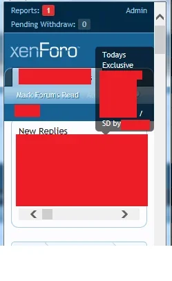
In fact, [BD] Image add-on already does this for it's new replies and its the same style as the media block. When hovering over the thumbnail a bubble pops up with the title name and even in responsive it still shows the full title.

This would be better for the media block

Here is an image of [BD] image in normal view

a.webp

Here is an image of [BD] image in responsive view

b.webp


it works better, even maybe having a setting "disable titles in mobile"
 
You can already specify how many media items to display at different widths in the block in the XFMG - New Media Block Settings style properties - set to 1 in each case if you only want to display 1 media item.
I tried to achieve this but it doesn't change the thumbnail size and when I set display only 1, the thumbnail showed always has the same size. Altering slide width doesn't seem to modify thumbnails sizes.

It would be better if a bubble showed up with the title name
Yes a bubble or anything that helps to identify the media and entice people to visit/share/comment it.
 
Top Bottom