You are using an out of date browser. It may not display this or other websites correctly.
You should upgrade or use an alternative browser.
You should upgrade or use an alternative browser.
Hover Over Title Is Awesome
- Thread starter Brandon_R
- Start date
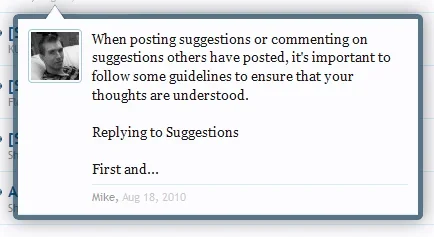
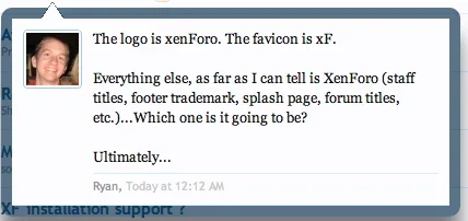
Looking at it... I think I like the thicker border to be perfectly honest. It actually looks cleaner with the chunkier border style than the thin one.
Looking at it... I think I like the thicker border to be perfectly honest. It actually looks cleaner with the chunkier border style than the thin one.
absolutely, the thick border is much nicer.
The transparent border looks like a modern design from Apple.
Looking at it... I think I like the thicker border to be perfectly honest. It actually looks cleaner with the chunkier border style than the thin one.
I have to agree now I seen the thinner border. I think the thickness of the border being so thick was an intentional step to stop your eyes wandering away. It serves as a visual container, which is my theory.
Very well said Shelley... it does stop your eyes shifting from the white preview to the white background. That border really allows your eyes to focus better on the preview. Maybe that would be different if the content background was a different colour.... though using white, it absolutely captures it as an isolated object within the page using that thick border.It serves as a visual container, which is my theory.
David Thomas
Active member
Holy crap, this scared the jeebees out of me!
I love the thread preview. Unique, useful, yet unobtrusive. Good work!
I love the thread preview. Unique, useful, yet unobtrusive. Good work!
also, the thick border is in line with the other XF-design.
Have a look at the border of "Quick Navigation Menu".
Can we have the same border at the member-setcard ?
Is it just me, but when looking on Kiers member-setcard, the text goes to the very bottom of the border.
Have a look at the border of "Quick Navigation Menu".
Can we have the same border at the member-setcard ?
Is it just me, but when looking on Kiers member-setcard, the text goes to the very bottom of the border.
Are... just found Brandon... sorry mate, didn't mean to rain on your thread. Feel free to merge this with http://xenforo.com/community/threads/hover-over-title-is-awesome.2849/
Awesome... I visit XF once every few days, and every time I end up saying WOW! That's cool!
Now, if only they did a CMS....
Me too. If they did a CMS I reckon it'd be similarly awesome, and I like that Kier liked your post. I hope it means we have something to look forward to on the CMS front
Very nice feature, so neat and tidy.
I wonder what it would take to say, after reading a whole thread and popping back to the forum home, another member replies to that topic, so you go back and hover over the thread title. Here it shows you the last unread post in that thread... And below this (in the same preview window) shows you how many other replies has been posted (since last visit to said thread). Or would this require too many queries and slow things down too much.
I wonder what it would take to say, after reading a whole thread and popping back to the forum home, another member replies to that topic, so you go back and hover over the thread title. Here it shows you the last unread post in that thread... And below this (in the same preview window) shows you how many other replies has been posted (since last visit to said thread). Or would this require too many queries and slow things down too much.
Are... just found Brandon... sorry mate, didn't mean to rain on your thread. Feel free to merge this with http://xenforo.com/community/threads/hover-over-title-is-awesome.2849/
Merged.
Great feature and very smooth implementation. Regarding these hover effects, is there a way to see them when browsing from a mobile device?
I wonder if it could be extended so when a post contains a link to another thread in the same forum, the preview generates for that as well.
I wonder if it could be extended so when a post contains a link to another thread in the same forum, the preview generates for that as well.
I agree. Now I've seen a thinner border version and realize that I hate it, I love the real version with the thick border even more. Maybe it just took me by surprize the first time I saw it.Looking at it... I think I like the thicker border to be perfectly honest. It actually looks cleaner with the chunkier border style than the thin one.
I agree. Now I've seen a thinner border version and realize that I hate it, I love the real version with the thick border even more. Maybe it just took me by surprize the first time I saw it.
The thicker border is certainly better. I noticed a lot of people where saying that to thin the border a little so commenced with the mockup. It has to be said the thicker border (for reasons I mentioned previously) is visually better and more practical.
Have I ever told you that I am totally jealous of your graphics skills? I'd be stumped for visualizing things if it wasn't for geniuses like you making pretty pictures that explain everything nicely and without the need for imagination and a million words trying to describe things.The thicker border is certainly better. I noticed a lot of people where saying that to thin the border a little so commenced with the mockup. It has to be said the thicker border (for reasons I mentioned previously) is visually better and more practical.
Similar threads
- Question
- Replies
- 10
- Views
- 223
- Replies
- 0
- Views
- 418
- Suggestion
- Replies
- 2
- Views
- 571
- Suggestion
- Replies
- 1
- Views
- 483
- Suggestion
- Replies
- 254
- Views
- 22K

