You are using an out of date browser. It may not display this or other websites correctly.
You should upgrade or use an alternative browser.
You should upgrade or use an alternative browser.
Forum topics as grid
- Thread starter petalstats
- Start date
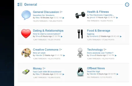
there is one style: http://xenforo.com/community/resources/quark.1101/I have been searching Google to see if there is a theme for this or whether it is in the styling options at all.No i don't mean sub forums as grid either.I have took a picture of what i would like and whether it is a theme or whether it can be done by template edits,Can this be done for xenforo
View attachment 38967
petalstats
Member
Thank you shame it is so so dark.I will have to see whether i can get some one to code into my forum theme or get someone to make a custom theme for me
petalstats
Member
I am asking someone to look into the code for this over the next few days.If i can get it working by just a little template editing then i will gladly share it here.As i really dont want to pay for a new theme especially one i do not likeYes it would be good to have just a 2 cols option/ template edit without taking on a whole style.
Should be quite possible with css for two containers side by side but I'm duff at actually doing css. Did about 10 yrs plain html work from 1996 onwards before css and it's hard to learn new tricks when my fingers knew the old stuff w/o thinking.
Might be good to have a new template for that which inserts so the only code that adds to the existing template is the insert.
Or might be poss in EXTRA.css
Like I said I know HOW it's done but actually coding css is a nightmare to me!
Might be good to have a new template for that which inserts so the only code that adds to the existing template is the insert.
Or might be poss in EXTRA.css
Like I said I know HOW it's done but actually coding css is a nightmare to me!
I have been searching Google to see if there is a theme for this or whether it is in the styling options at all.No i don't mean sub forums as grid either.I have took a picture of what i would like and whether it is a theme or whether it can be done by template edits,Can this be done for xenforo
View attachment 38967
I found the dual column listing but the resource has been deleted. Steve is still active here so it might be worthwhile and shooting him a PC http://xenforo.com/community/threads/2-column-node-list-deleted.34559/
From there you can install this add-on for your different node icons http://xenforo.com/community/threads/custom-node-icon-icon-for-category.30720/
petalstats
Member
Thank you so much Shelley i have the icons in place just want the nodes sorted out.I like how it looks
petalstats
Member
It is a vBulletin forum i found while searching for what i wanted for xenforo. Just got to wait for the modification to be worked on and offered here to xenforo customers
It is a vBulletin forum i found while searching for what i wanted for xenforo. Just got to wait for the modification to be worked on and offered here to xenforo customers
Take into account subforums any you might create will be going on the same line as threads and posts. it's an area of xenforo I loathe (I prefer the column layout) you can check that out at the following url if that was another alternative you wanted to take with this dual nodelist layout. http://xenforo.com/community/resources/sub-nodes-in-columns.580/
On the default style it was surprisingly easy to get it working, just add this to extra.css:
Other styles might need some more tweaking.
EDIT: Default needs more tweaking as well, especially in terms of sub forum listings within forums.
Code:
.node.level_2 {
  float: left;
  width: 50%;
}
.node.level_1 {
  clear: left;
}EDIT: Default needs more tweaking as well, especially in terms of sub forum listings within forums.
On the default style it was surprisingly easy to get it working, just add this to extra.css:
Other styles might need some more tweaking.Code:.node.level_2 { float: left; width: 50%; } .node.level_1 { clear: left; }
EDIT: Default needs more tweaking as well, especially in terms of sub forum listings within forums.
I did this before several months back but found the space limited unless you have a sidebar toggle (which i had developed) to free up the space.
I'm quite sure the other issue with it looking crammed was when you created sub forums although I never tried the grid subforum system at the time to see if that freed up space and improved the layout. Might give this another try again and use CyberAP subforum modification.
That is the basic way of getting a two column grid. I tested it on a 1600x800 screen, and it didn't too cramped, but it needed tweaking. You can of course move stuff around, like the last post and rss icons. Also, this also makes the sub node listing inside a parent node a two column grid, so you need to add in the clear: left on that, it might be done via :after.
It would be natural that you changed the node stats and last post bit, to fit a two column layout.
It would be natural that you changed the node stats and last post bit, to fit a two column layout.
petalstats
Member
Ive tried the code and it is not working it is causing spaces between forums and does not line up which is a shame as i really like it
My code above? All that does is to fit each node level 2 be half the width, so there are room for another listing to the right of it. I tested it on two different styles now (Soft Responsive, and Default), it works on both, but further changes must be done to make it look pretty.Ive tried the code and it is not working it is causing spaces between forums and does not line up which is a shame as i really like it
On the top of my head, I would also assume that if position: absolute is used on the node lists, it won't work as intended.
That is the basic way of getting a two column grid. I tested it on a 1600x800 screen, and it didn't too cramped, but it needed tweaking. You can of course move stuff around, like the last post and rss icons. Also, this also makes the sub node listing inside a parent node a two column grid, so you need to add in the clear: left on that, it might be done via :after.
It would be natural that you changed the node stats and last post bit, to fit a two column layout.
I agree on higher resolutions it's fine. it's when you have someone pop along saying it looks crammed and when i ask what resolution they are running at they're saying 1280x so I had to cater for the lower end res users but eventually gave up on the dual column.
However, I'm going to give this another try again because I like the dual column (especially just for my resource node areas) so I'll shorten the last post (removing latest prefix phrase frees up lots space) which i didn't do amongst other things and work through the whole column thing again. I think i may have a little more success with it on what I want to achieve.
I just took a look at the last post bit, and it should be fairly easy to move around. I think it would make sense to remove the box stylings on it and move it below the node title, and then move the RSS icon to the right.I agree on higher resolutions it's fine. it's when you have someone pop along saying it looks crammed and when i ask what resolution they are running at they're saying 1280x so I had to cater for the lower end res users but eventually gave up on the dual column.
However, I'm going to give this another try again because I like the dual column (especially just for my resource node areas) so I'll shorten the last post (removing latest prefix phrase frees up lots space) which i didn't do amongst other things and work through the whole column thing again. I think i may have a little more success with it on what I want to achieve.
This is how it looks on my test site:

I just took a look at the last post bit, and it should be fairly easy to move around. I think it would make sense to remove the box stylings on it and move it below the node title, and then move the RSS icon to the right.
This is how it looks on my test site:
View attachment 39110
Yeah, the lastpost box styling is something I have recently started to remove in my styles and it gives off such a cleaner feel so that's one of the things I'll be doing (screen Below). The padding/margin also freed up tons of space i found when I built a dark fixed style so definitely going to tinker with that. Great stuff, you've motivated me again to tinker and come up with something again with regards to the column.

Similar threads
- Replies
- 1
- Views
- 60
- Replies
- 7
- Views
- 1K
- Question
- Replies
- 0
- Views
- 787
- Question
- Replies
- 4
- Views
- 2K
