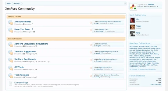
I really like how you did the similar gradients in thread display and feel this should be carried over to the forum home cat gradients. I feel the blue text on the baige/orange gradient doesn't look as nice as the thread display counterpart which has a darker brown text which i feels stands out better. Not to mention I think the 1 px border on the thread display gradient is a nice visual touch which is not currently present on the forum home gradient. (mockup below)
Attachments
Upvote
3
")