You are using an out of date browser. It may not display this or other websites correctly.
You should upgrade or use an alternative browser.
You should upgrade or use an alternative browser.
FamilyGuyFans.com
- Thread starter Sheldon
- Start date
![fgflogos[1].webp](https://xenforo.com/community/data/attachments/31/31296-7710de7310f7265f559c12a4df06060c.jpg?hash=dxDecxD3Jl "fgflogos[1].webp")
Nice logo !

Cute and effective.
")
Created my FB Timeline to tie into the site as well... Using the add-on XenSocialize by xenCODE as well, hope to drive some traffic that way. Here is my "timeline cover":

Yes, I was a little bored. Hah.
Yes, I was a little bored. Hah.
I really like the slider you are using right under the breadcrumb! Is that an add on? How was that implemented as I am looking for something similar for my forum! I will be honest, not a big Family Guy fan but I really love your forum. Came out really well!
I really like the slider you are using right under the breadcrumb! Is that an add on? How was that implemented as I am looking for something similar for my forum! I will be honest, not a big Family Guy fan but I really love your forum. Came out really well!
That's part of the xenPorta add-on that Stew installed.
Cool articles !www.familyguyfans.com , click on FAQ's.
I liked your FAQ on Quotations. But the link to it isn't where I expected.
On this page: http://www.familyguyfans.com/quotes/
Quotations
This is a list of quotations saved by the members of Family Guy Fans.
Quotations
This is a list of quotations saved by the members of Family Guy Fans. Learn more here.
How about a link to the Quotations FAQ from the Quotations Tab ?
Cool articles !
I liked your FAQ on Quotations. But the link to it isn't where I expected.
On this page: http://www.familyguyfans.com/quotes/
Quotations
This is a list of quotations saved by the members of Family Guy Fans.
Quotations
This is a list of quotations saved by the members of Family Guy Fans. Learn more here.
How about a link to the Quotations FAQ from the Quotations Tab ?
That is the "Discussion" fromt he FAQ about how to post a Quote to be moderated and added. That is the intent. That was why I added "learn more here".... to show.
I added Learn more here
How about a link to the Quotations FAQ from the Quotations Tab ?

Nice idea!
")
I added Learn more here
Then I am confused.... hahaha.
Curious as to what anyone thinks about how I am doing this....
http://familyguyfans.com/threads/season-listings.18/
I am in the process of listing all the Family Guy seasons and episodes, and I added in the Amazon Block on the side for guests/members to go and purchase each if they would like. Is this a decent idea, or does it take away from the thread? [It is locked, and replies will not be allowed. Plus, it is the only area the Amazon Block will be showing]
Big empty space on your quotation pages between the title and attribute:

Slider text needs a bit more height or less size on opening, as you can see below, the second line disappears in Safari:

Nice site overall.
Slider text needs a bit more height or less size on opening, as you can see below, the second line disappears in Safari:
Nice site overall.
Added a couple new things...

Posts are slowly coming in, as are members... either way, this is something I really enjoy (Family Guy), so it can take as long as it needs to get busy... haha.
Thanks for the compliment Anthony, haven't forgotten about your suggestions, I will eventually get around to them.
- Purchased the Notifications add-on by Chris Deeming (to be implemented)
- Added Quahog Cinema, which will stream full length episodes in each post.
- Started changing the Forum Status icons, slowly but surely. I think I have to go back and redo those again.
- Also playing around with the Node images, not sure exactly what I want to do with it yet or if it is something I want to keep.
Posts are slowly coming in, as are members... either way, this is something I really enjoy (Family Guy), so it can take as long as it needs to get busy... haha.
Big empty space on your quotation pages between the title and attribute.
Slider text needs a bit more height or less size on opening.
Nice site overall.
Thanks for the compliment Anthony, haven't forgotten about your suggestions, I will eventually get around to them.

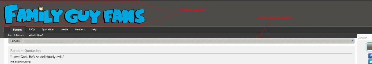
I think you should add some spacing to the logo giving it some breathing space between the top and navbar
Also I noticed the breadcrumbs having no spacing between the top of the breadcrumbs and navbar. Dunno if that was intentional, if not i would add some margin
edit: What I would actually do is scale the logo down a little and add in that reflection like your signature here. That imo would set it off nicely.
Code:
#logo {
    padding: 10px 0;
}
Code:
.breadcrumb {
    margin: 10px 0;
}
edit: What I would actually do is scale the logo down a little and add in that reflection like your signature here. That imo would set it off nicely.
Attachments


edit: What I would actually do is scale the logo down a little and add in that reflection like your signature here. That imo would set it off nicely.
Keep Stewie in too? Or just the words?


Similar threads
- Replies
- 0
- Views
- 82
- Replies
- 1
- Views
- 103
- Replies
- 9
- Views
- 125