ExoticFishForum.com - phpBB to xenForo Conversion

exotic.fish.forum.logo.webp

Love the logo.
Is there a way to get a fish to swim around at the top ?
It might be fun to watch the yellow fish swim around.
Probably could be done with a minimum of coding too ?

What I mean is keep the logo, but the fish swims around in the entire area.

fish.tank.logo.webp

Maybe it can get caught up in the O ... or maybe there should be two fish with one permanently stuck :)

Ideas:
A gallery of fish tanks ?
A wiki of exotic fish knowledge.
Xenporta for a "Latest News".

Make the yellow fish your trademark at have it throughout the design.

Change the boring / ugly default avatar.
yellow.fish.for.default.avatar.webp

Hide member list from Guests.
http://www.exoticfishforum.com/members/
 
There's not a lot of customization, but you don't need too much anyway, people there are into fish not web design. You have chosen some very nice colors and the logo is a killer. Love it. I think the forums look enticing and good, so just build up from here. Best of luck with the community ;)
 
Ah ha! I see one of your mods is into Discus fish, I used to breed and sell them. Used to sell whiteworm cultures on the web for them also. Nice logo, but the theme could do with being a little more fishy, may green and blue colours mixed might suit the Aquatic theme better overall.
 
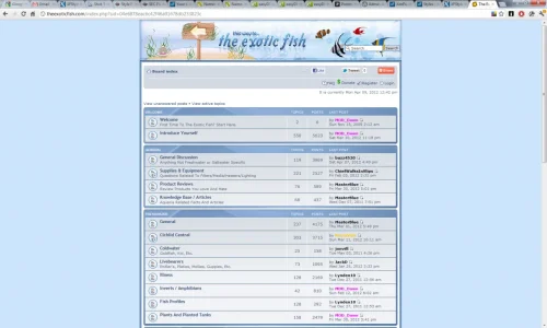
Looks nice and clean overall, and you've kept it simple.

I agree about changing the default avatars but don't like the bright yellow suggestion. Why not keep it grey still but have an outline or silhouette of a fish? Or bubbles? Or anything fish related.

I think your logo is excellent, but is there anything you can do with the empty space to the right of it?

This is just a personal opinion, but on Xenforo I don't like it when you put stats and location back in under the avatar, this goes against the whole point of removing them (so you get a clean, streamlined page that concentrates on post content, not stats, which you can still view on the member card). For example on this page, you have several one line replies, but so much gap inbetween because of the expanded avatar area:

http://www.exoticfishforum.com/threads/hey-im-new.5858/

Try taking those stats out so you just have the avatar, name and rank, then see how much better it looks :)

Would you benefit from a fish-themed node icon, rather than "NEW" that you have now?
 
I like the logo, but due to the size of it you've got too large an empty space going on to the right of it, which in turn is dropping the forum eye level unnecessary lower down than need be. If you intend to stick a banner advert there to fill that void on the right - fair enough, that will bring things together. But if your not planning to display anything to fill that area, I'd consider making the logo much smaller in height.

Messing around then, I can get it down to 100px high from 147px and still look OK quality wise.

exotic.fish.forum.webp
 
Top Bottom