DiabloPhilia.com - Working on new forum

Lykke

Well-known member
Hey :)

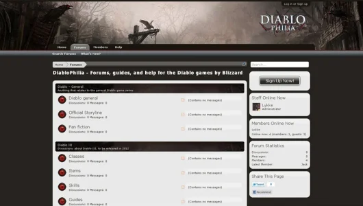
Working on a new forum style for our new forum Diablophilia.

Still working with small tweakings - and I am going to change the logo and use Portal too (and see how the style works with that).

Diablo.webp
You are welcome to visit the (very empty :eek: ) forum here: www.diablophilia.com

Thank you :)
 

Attachments

  • Diablo.webp
    Diablo.webp
    46.8 KB · Views: 9
One of the better dark styles I have seen so far. I like the way you are using a light background inside the forums. But maybe the contrast is just a little bit too much, perhaps adjusting the light background in the forums to mimic the lighter parts of the warm grey you have in the header pic.

Just my $0.02 cents :)
 
I don't know if the white fits a Diablo website. I have seen a lot of Diablo websites and they're pretty dark.
Yeah, most dark forums are dark all over. It's a pain to read them, and I really like this approach - although with a slightly darker forum background (but not all black!).
 
Thanks for great feed-back :)

I have seen (and created) many game sites and overall my own feeling is, they are too dark. I understand the 'darkness' in a Diablo site - but you should still enjoy reading the forum. A lot of white text on black background really annoys my eyes as does colored text on black background. I wanted to create a 'dark' different theme with more 'lightness' - and still having the creepy theme in an elegant way :cautious:

I changed the white to a slight grey color and the bg is not 'black' anymore. The font is not darker the places where it was light grey before (and hard to read).

I also changed the color of the breadcrum - it wasn't right before.

@ kkm323 - I don't understand you say it's slow - it runs very fast here?

Again, thanks (y)
 
Yeah, most dark forums are dark all over. It's a pain to read them, and I really like this approach - although with a slightly darker forum background (but not all black!).
My favorite Diablo websites are dark - the best color combination is dark, and red. I have seen one website that does this combination and I wish I had a diablo website and a design like that.
I have seen (and created) many game sites and overall my own feeling is, they are too dark. I understand the 'darkness' in a Diablo site - but you should still enjoy reading the forum. A lot of white text on black background really annoys my eyes as does colored text on black background. I wanted to create a 'dark' different theme with more 'lightness' - and still having the creepy theme in an elegant way
Well, you don't really need a really dark site... But you could have made a dark theme that has some hues that are pleasing for the eyes. Like dark-grey, and a darker-grey. Like GamerBB here. And as I said before, the best Diablo skin has dark-red on it to go along with the dark graphics it had.

I think it was DiabloFans, hm. Ah, yes it was. Here ya go.
 
My favorite Diablo websites are dark - the best color combination is dark, and red. I have seen one website that does this combination and I wish I had a diablo website and a design like that.

Well, you don't really need a really dark site... But you could have made a dark theme that has some hues that are pleasing for the eyes. Like dark-grey, and a darker-grey. Like GamerBB here. And as I said before, the best Diablo skin has dark-red on it to go along with the dark graphics it had.

I think it was DiabloFans, hm. Ah, yes it was. Here ya go.

It is indeed a nice site - just far from my own taste - but I think that it's awesome to see how many different 'versions' of forums can be made of the same theme. I created Diablophilia with the same theme first - black and red - but changed it. Personally I am not trying to create something other's already made with success, but something new. I am not into colored text on a black background btw - it hurts my eyes - but I think the colors there are great for that forum. No doubt.
 
Top Bottom