CSS Styling Question - What's the right way to do this -

TheBigK

Well-known member
I'm planning to show two advertisement blocks side by side, in the space between first and the second post on every page. With my own trials and errors; the ads look like this:-
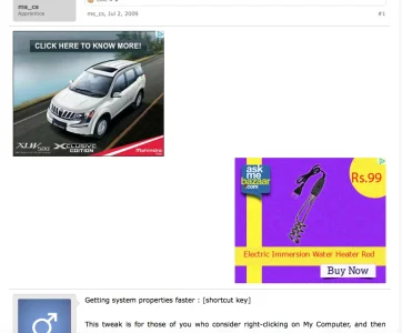
Screen Shot 2015-03-13 at 8.13.36 pm.webp

But I'd like to display them like this -

First Post Content
-------------------------------------------
.......[ad1] <10px space> [ad2]..........
-------------------------------------------

...and my best CSS attempt has been this:-
HTML:
.afp-left { display: inline-block; text-align:left;}
.afp-right {display: inline-block; vertical-align: baseline; text-align:right;}

and HTML:

HTML:
<div class="afp-left">
Script for ad1
</div>

<div class="afp-right">
Script for ad2
</div>

But this makes the ad2 box appear directly below the ad1 box and both are left-aligned in the area after first aligned.

PS: I'd like the ad2 box to actually move below ad1, in a narrow (mobile) layout; to make the ad-space responsive.

Would really appreciate your inputs!
 
You can just float them.
I read somewhere that 'float' isn't the efficient way of doing it. So I kept trying without using float.

With float, will it be simply like -

Code:
.afp-left {float: left;}
.afp-right {float:right;}

But that'd position the boxes on two extreme ends? How do I get them closer to each other? Also - will float allow them to align vertically on narrow layouts.
 
Maybe it can work with CSS like this:

Code:
.afp {
position:relative;
display: inline-block;
width: 150px;
}

Adjust the width to suit!


... and HTML like this:
HTML:
<div align="center" class="afp">
Script for ad1
</div>

<div align="center" class="afp">
Script for ad2
</div>
 
Maybe it can work with CSS like this:

Code:
.afp {
position:relative;
display: inline-block;
width: 150px;
}

Adjust the width to suit!


... and HTML like this:
HTML:
<div align="center" class="afp">
Script for ad1
</div>

<div align="center" class="afp">
Script for ad2
</div>
I still can't this to work.

You can see it on any discussion; for example: http://www.crazyengineers.com/threads/p-e-exam-experience-4a-form.79412/ . The blocks appear one over the other now, center aligned.
 
I still can't this to work.

You can see it on any discussion; for example: http://www.crazyengineers.com/threads/p-e-exam-experience-4a-form.79412/ . The blocks appear one over the other now, center aligned.
I see that you have been changing your html up and such but as an example with your current markup if you only wish to use css to control the layout you can add this to extra.css

Code:
.afp {
    display: block;
    float: left;
    max-width: 100%;
    min-width: 50%;
    overflow: hidden;
}

You could also go one step further and then add a media query @ max-width at something like 720px to force the wrapping blocks to a 100% width which they will auto center on based on the rest of the css I see in there. There are better ways to do the html markup for what you are trying to achieve but you can make what you have useable with very little work and tweaking.

I only took a minute here off the top of my head so test it to be accurate.
 
No luck with that either. I'm wondering if the changes I'm making are actually being applied. We do caching and I'm guessing that MIGHT be preventing CSS changes from being applied instantly? Can that be a case, @MattW ?
 
take a look at everything above that and make sure you don't have any unclosed tags, comments etc..
The CSS above .afp has been in place for quite some time and I'm sure there are no open ends.

Can I use float and get this working? If yes, could you please tell me how to use floats?
 
The CSS above .afp has been in place for quite some time and I'm sure there are no open ends.

Can I use float and get this working? If yes, could you please tell me how to use floats?
Well at this point it's not a matter of how to use one thing or the other...the css rule is not applying as you can see from my image below where the html concerning .afp is highlighted and there is no style information being shown for it.
sdfsdf.webp
 
The css rule is being applied to the threads that have not been visited since we applied cache. What worked so far is the following -

Code:
<div style="display: block; max-width:100%;">

<div style="float: left; margin-left: 40px;">
SCRIPT -1 
</div>

<div style="float: right; margin-right: 40px;">

SCRIPT -2 


</div>

</div>

However this approach does not work on narrow mobile layouts. I get two elements aligned left/right.
 
Alrighty! I finally figured this out - but with just one minor problem. The blocks don't align center when viewed on mobile layout.
Code:
<div style="display: block; max-width:100%;">

<div style="display: inline-block; width: 48%; text-align:left;">

SCRIPT-1
</div>

<div style="display: inline-block; width 48%; text-align: right; margin: auto; ">

SCRIPT-2

</div>

</div>
 
Top Bottom