Content not sized to viewport

briansol

Well-known member
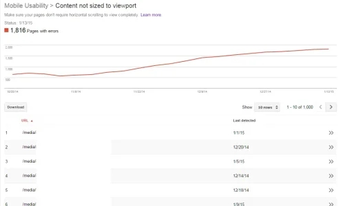
Since installing the media gallery (pre xf ownership), I've had my webmaster tools warning report ramp up about content not sized to viewport. I've upgraded to latest versions last week and nothing has changed.

Given that images are images, what's the best way to solve this? auto scale?
 

Attachments

  • medianotsizedtoviewport.webp
    medianotsizedtoviewport.webp
    24.4 KB · Views: 5
It's not actually your gallery content.

It's your ads. Here's a screenshot:

upload_2015-1-21_17-6-47.webp

Try implementing some sort of responsive ad units. For support with that, consult your ad provider or search XF.com as there are guides on implementing responsive ads through various providers.
 
Interesting... as I am using google's responsive ad units in the global header ad template, and it DOES respond on the main forum areas like this and the media area for me...

Code:
<div style="text-align: center">
<script async src="//pagead2.googlesyndication.com/pagead/js/adsbygoogle.js"></script>
<!--  Header Responsive -->
<ins class="adsbygoogle"
style="display:block"
data-ad-client="ca-pub-xxxxxx"
data-ad-slot="xxxxx"
data-ad-format="auto"></ins>
<script>
(adsbygoogle = window.adsbygoogle || []).push({});
</script>
</div>


ad.webp


G ads won't refresh/rebuild onResize, so scale down then F5 and you should see it that was as well.
 
Last edited:
It responds for me as well (have to have the window shrunk first; it doesn't tend to show an ad at the top when it's very small).

I would note that at the smallest my Chrome window is going, the ad in the sidebar causes it to slightly overflow. Otherwise, I'm not seeing any overflow issues when browsing.
 
When i have my chrome shrunk down as far as it will go, i don't get any ads at all in the side bar.

To note, no reports of the media index are showing up, it's actual image pages.

ie, try:
media/door-chime-location-crx.2558/


Since the homepage doesn't show the sidebar on small screens, but the media gallery does, i think that may be the issue with the ad unit in the sidebar.


Can we turn off or otherwise make the sidebar more responsive for super small devices?

any suggestions for a @media query for the ad unit block?
 
I don't think a media query to hide the ad unit is the way to go, as you'd still be serving the ad but not displaying it. You may need to adjust the JS code to not serve that ad below a specific width (as in, don't insert the standard div/ad code in that case).
 
Top Bottom