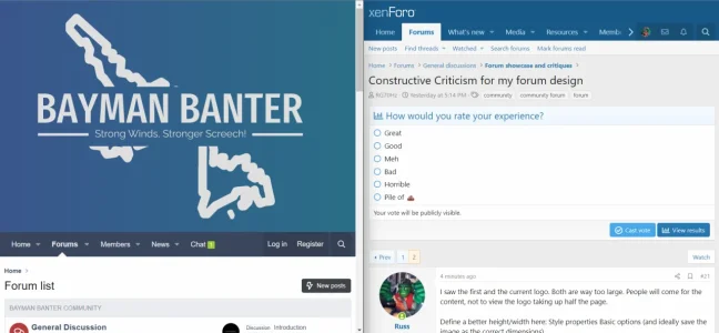
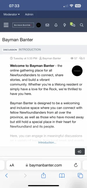
I saw the first and the current logo. Both are way too large. People will come for the content, not to view the logo taking up half the page.
Define a better height/width here: Style properties Basic options (and ideally save the image as the correct dimensions).
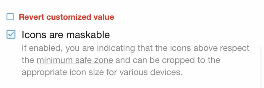
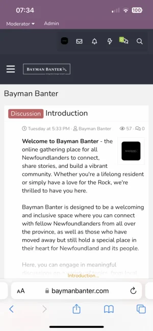
Define a better height/width here: Style properties Basic options (and ideally save the image as the correct dimensions).