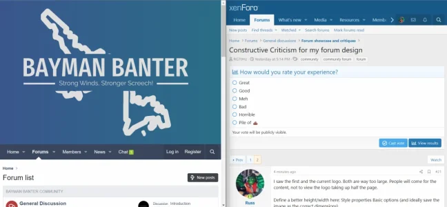
What did you view it on? It's not big on mineI saw the first and the current logo. Both are way too large. People will come for the content, not to view the logo taking up half the page.
Define a better height/width here: Style properties Basic options (and ideally save the image as the correct dimensions).
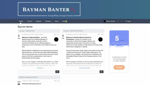
Unless this is what you mean by big? I can't really see it being an issue but I will take it into consideration. I appreciate your feedback.I saw the first and the current logo. Both are way too large. People will come for the content, not to view the logo taking up half the page.
Define a better height/width here: Style properties Basic options (and ideally save the image as the correct dimensions).
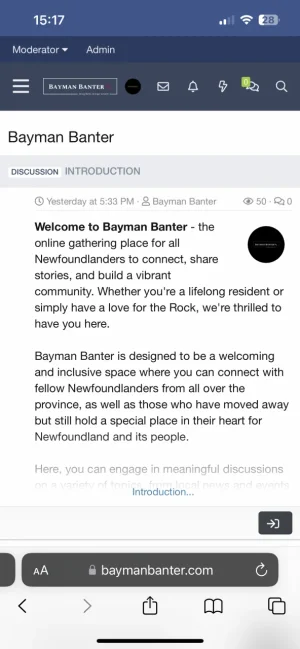
Oh what the hell that's so strange. That's an old logo. Yeah that is huge lol. No good. I you refresh it should be reverted back to normal now. Thanks for the heads up thoughI attached an image of how it was showing for me (I'm on a smaller device at the moment)
I still think the header area is taking up way too empty space. It's just a lot of space to scroll past to read the content.
In my opinion, there are too less now. Ideally you want to start out with 3 categories with each 3-4 forums.Would you mind having another look and tell me what you think so far? The logo hasn't changed yet. I will update that soon, if at all. I kinda like it but haven't got feedback from users or anything so time will tell
That's what Im going to spend the next few hours doing. I just wanted to strip it down and start from scratch so I can build as I go. Originally I just made every forum and category and didn't do anything with permissions, etc. So now I am going to do it as I go!In my opinion, there are too less now. Ideally you want to start out with 3 categories with each 3-4 forums.
I did all of that already and now I’m back to square one. I had 130 nodes in my forum lost along with custom pages but I was getting too far ahead of myself. The addons I have are essential to my forum. For instance, the porta pro addon allows me to promote and stick threads to my home page which is what I tried accomplishing before without it but it didn’t look as nice. That chat I had was basic but now it allows for rooms and such. I have the porta calendar add on so I can create local events and map then to it. I also have the anonymous add on which is majority essential to my forum.My opinion is that you should stop installing new add-ons and focus on setting up and structuring the essence of forums: user groups, categories, forums, sub-forums, creating prefixes ( it's not nothing), managing permissions (it's not nothing either)... A Chat, a portal, yes, but start at the beginning. When all this is in place you can think about the logo, add-ons, customization...
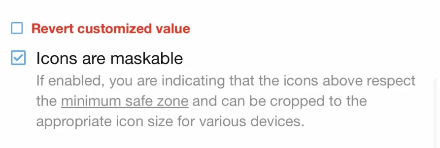
Do you think I should turn off logo masking? I think that may be contributing to thatLooks good. Mind the logo on mobile -1 can hardly see what it says. Also, red on a blue background not ideal as it gets swamped.
I’m not sure if this would be the cause but I’m think it scales to logo according to the device you’re using. It’s small on mine too. I’ll try and turn it off to see if that makes any difference.What is Logo masking?
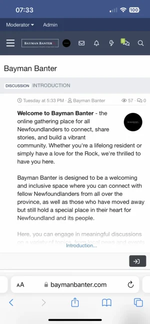
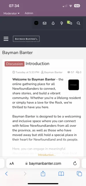
The issue is that the logo does not work when it is much smaller dimensions, the text becomes way too small to read.View attachment 282679
But more or less everything has to be scaled reposonsively. In my screenshot above there is no room for a larger logo. And there is so much margin around the text is is tinyI’m not sure if this would be the cause but I’m think it scales to logo according to the device you’re using.
That may be the style I’m using. The ipbb style has given be a couple issues. I’m not sure how to fix that issue if I’m being honest. I agree that things are too small thoughBut more or less everything has to be scaled reposonsively. In my screenshot above there is no room for a larger logo. And there is so much margin around the text is is tiny
Thanks for the tip! I was unsure but yeah the mobile logo is really small. Maybe it would be better to use the board name initials in text like mentioned. Instead of the logo it could say “B.B.” or somethingThe logo management really sucks on XenForo, it looks like it was only designed for the original XenForo logo or so like all our forums are going to have a simple 6 or 7 letter logo...
BTW regarding the attachment, Icons are maskable setting only concerns the PWA buttons on the devices, not the logo.
That’s a neat resource! Thank you so much for sharing that with me.Maybe you can show a mobile header: https://xenforo.com/community/resources/cxf-mobile-logo-header.7488/
And adjust the code to hide the small logo when scrolling, maybe.
I’m wondering if I could adjust it so when the user scrolls up, the icons for profile, alerts, etc will expands over to the left and when you scroll down it collapses as it already is. Does that make sense?Maybe you can show a mobile header: https://xenforo.com/community/resources/cxf-mobile-logo-header.7488/
And adjust the code to hide the small logo when scrolling, maybe.
We use essential cookies to make this site work, and optional cookies to enhance your experience.