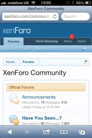
Per this fix: http://xenforo.com/community/thread...-if-there-is-still-space-for-few-links.54186/
You've done a great job improving this. On iPhone I now see more which is great.
Sadly, however, it has hidden the nav tab drop down.

This is a suggestion for a fix: What if, in this scenario, pressing the one remaining tab would open a menu containing the other tabs.
It would involve decorating that tab as such with the 3 lines to indicate that was the behaviour but I think it could be the best of both worlds.
Easiest fix is to not hide the nav tab drop down but then a big portion of mobile users won't benefit from the aforementioned fixed bug/suggestion. Because it seems to me like if the nav tab drop down remained in the navigation area, the only choice then is to collapse the account/inbox/alerts menu. And although I like that menu, it is rather tedious sometimes not being able to load your current alerts in a single click.
You've done a great job improving this. On iPhone I now see more which is great.
Sadly, however, it has hidden the nav tab drop down.

This is a suggestion for a fix: What if, in this scenario, pressing the one remaining tab would open a menu containing the other tabs.
It would involve decorating that tab as such with the 3 lines to indicate that was the behaviour but I think it could be the best of both worlds.
Easiest fix is to not hide the nav tab drop down but then a big portion of mobile users won't benefit from the aforementioned fixed bug/suggestion. Because it seems to me like if the nav tab drop down remained in the navigation area, the only choice then is to collapse the account/inbox/alerts menu. And although I like that menu, it is rather tedious sometimes not being able to load your current alerts in a single click.