Alpha1
Well-known member
If a site has more than a few addons then the navigation menu becomes unusable. You will get a mass of hidden tabs that users need to horizontally scroll to. Each tab has its own drop down and these can easily go below the fold. As a result users get lost and leave the site. The users that stay simply do not use the addon content. The most common complaint we get is that users cant find anything.
Here is a screenshot to give an impression:
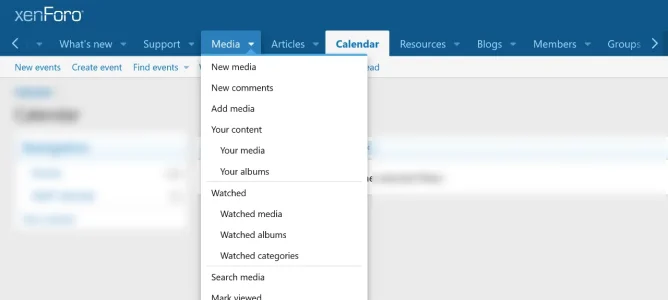
Please disregard the order of the tabs as its a screenshot of a development site.
My main suggestion is to improve the menu system so that it becomes possible to present main and sublinks in a better way.
For example by:
Multiple columns:
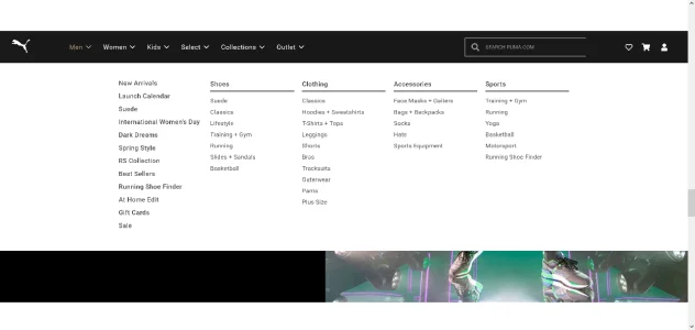
Multiple rows and icons/images:

Headers per column:
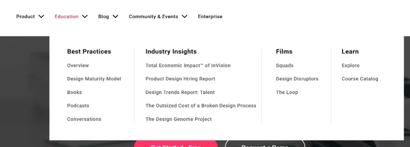
Menu Features like this allow us to display a large number of menu items in a visually appealing manner.
I think that its important to realize that people are mostly not looking for media, forums or resources. They are looking for information or content about a topic. For an answer to their question. They couldn't care less about the sea of links XF now shows. People almost do not click on the default navigation menu drop down links.
It's important to approach this in a way that is useful to forum users.
I also think its important to recognize that Google will index and rank a website according to its menu structure. The links in the navigation menu are treated as the most important pages of the website. Therefore a menu should have space for the most important pages. In its current form the menu is already overcrowded and gets unusable when more than a few addons are installed.
Here is a screenshot to give an impression:

Please disregard the order of the tabs as its a screenshot of a development site.
My main suggestion is to improve the menu system so that it becomes possible to present main and sublinks in a better way.
For example by:
- Allowing multiple addons to be listed in the same tab. For example we could have an Articles tab and in the drop down have links for both XFRM, AMS and UBS.
- Allow multiple columns in drop-downs.
- Allow for headings in each column.
- Offer 1 page for 'Your Content' and make it filterable. This would save a lot of menu entries in each drop down.
- Offer 1 page for 'Watched Content' and make it filterable. This would save a lot of menu entries in each drop down.
Multiple columns:

Multiple rows and icons/images:

Headers per column:

Menu Features like this allow us to display a large number of menu items in a visually appealing manner.
I think that its important to realize that people are mostly not looking for media, forums or resources. They are looking for information or content about a topic. For an answer to their question. They couldn't care less about the sea of links XF now shows. People almost do not click on the default navigation menu drop down links.
It's important to approach this in a way that is useful to forum users.
I also think its important to recognize that Google will index and rank a website according to its menu structure. The links in the navigation menu are treated as the most important pages of the website. Therefore a menu should have space for the most important pages. In its current form the menu is already overcrowded and gets unusable when more than a few addons are installed.
Last edited:
Upvote
15