Article/CMS system round up.

Carlos... I am creating a custom View for articles in XenPorta... how do YOU think an article should be displayed?

I myself, having articles rejected from Kotaku and Joystiq, do agree with you...
(thankfully, Siliconera and Destructoid dont reject my articles).
 
I too run a gaming site. I too have a desire to improve the appearance of content on the portal page. My basic suggestion is to allow the site to appear similar to a WordPress site.

I took a close look at the N4G site. I see an article listed on their home page: http://n4g.com/news/794314/constitutional-law-expert-expects-violent-video-game-bill-to-be-rejected

Two things I have noticed.

- the article title is altered on their home page. On the home page, mostly caps are used. When you click through to the article, that is not the case. It is not simply using all caps either as "to be" is not capitalized. It seems they have the ability to offer a custom title for an article on the home page. This is great as forum users often do not create the best titles for their threads.

- the description snippet is custom created. "A Constitutional Law Expert doesn’t believe..." is how the article is described on the portal. Once you click through to the thread, that text is no where to be found.

From a presentation viewpoint and SEO these two changes are great. If we can write our own title and description snippet for the content we wish to appear on the portal, that would certainly be a benefit.

Also, I understand and can use the promote feature to sort the order of articles, but it is more effort then it should be. An improvement would be a simple "promote" button and then a position selection would be better then a time/date stamp where you need to go into each article and figure out the date/time, and then manually create a time in between.

In large part, if we could just 100% mimic WP's method of displaying articles that would be great.

The only other comment I can make is I only ever tried once to get a forum post displayed on other sites. It worked well with Massively (Joystiq) and MMOSite both accepting the thread. My next attempt will be next month. If we can improve the portal page, that would be of help.
 
My point was that you can use Jaxel's system and with a few template changes and conditional statements, your article will not "be on a forum", it could look just like you're using wordpress or whatever. What it's running behind the scenes has no relevance if it's not visable to the end user.

I can't say that many other ways so I'll leave it now.
 
I am biased towards another X-based CMS that I helped found many, many, many years ago -- Xaraya - essentially this was the fork of PostNuke when that project got a bit out of hand - which was a fork of Burzi's PHPNuke... ah, the good old days. Xaraya was founded by a small group of some of the smartest, nicest and most generous developers I know. I haven't been there for a long, long time but that project progressed nicely. I think that Marty/Dracos is one of the few people still left at the project. They did a nice job with it and was a far superior product than many other CMSes.

Anyways... waxing about nostalgia. :)
 
X-based CMS
Is this what you mean by x-based ?
I see this articles area:
http://xaraya.com/index.php/articles

WordPress has a way of arranging content to make clean looking pages, even when those pages are stuffed with too many articles.
Wordpress does create clean looking sites.
But I'm not sure what parts you like here:
http://www.huffingtonpost.com/2011/06/15/hugh-hefner-tweets-about-_n_877296.html
 
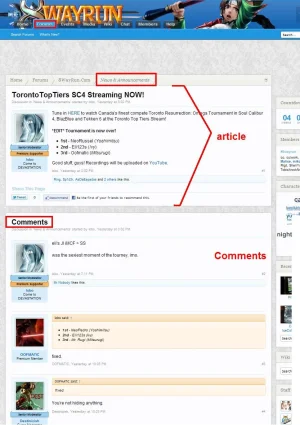
So it looks like Jaxel has turned his News & Announcements Forum into an Articles Forum, by changing the Style of this forum into a Article + comments appearance (vs. just a regular thread).

Suggestions:
change the forum listing (http://8wayrun.com/forums/news-announcements.78/) to make the entire forum look non-forum like.
ideally the comments could be smaller (ie. reduce the size of the avatar image).
 

Attachments

  • 8wayrun.articles.comments.forum.style.webp
    8wayrun.articles.comments.forum.style.webp
    113 KB · Views: 23
So it looks like Jaxel has turned his News & Announcements Forum into an Articles Forum, by changing the Style of this forum into a Article + comments appearance (vs. just a regular thread).

Suggestions:
change the forum listing (http://8wayrun.com/forums/news-announcements.78/) to make the entire forum look non-forum like.
ideally the comments could be smaller (ie. reduce the size of the avatar image).
Hows this?
http://8wayrun.com/threads/8wayrun-com-now-running-the-xenforo-beta.6406/page-10
 
Okay, I waited a while before responding, Mr. Jaxel. :D

I agree with the others saying that a "CMS" [Its broad and people use it loosely, so I'll go ahead and say it] should look like a blog post, and so far, you've accomplished that. Hell, I love that countdown box you've got at the right. I would love to do that in Wordpress, counting down the days and weeks until MODERN WARFARE 3 [caps because of excitement feel] releases.

However, your display is a lil...off. A blog post and/or a CMS article does not have forum-style avatars/username combo, like you showed. But it's quite alright since your design seems to mimic a blog post, which is actually a good thing. :)

Keep up the good work, Jaxel! :)
 
I agree, the postbit is the only thing I think is a bit off and changing it more to a horizontal postbit without an avatar but with links to their other articles, etc would work better.
 
Okay, I waited a while before responding, Mr. Jaxel. :D

I agree with the others saying that a "CMS" [Its broad and people use it loosely, so I'll go ahead and say it] should look like a blog post, and so far, you've accomplished that. Hell, I love that countdown box you've got at the right. I would love to do that in Wordpress, counting down the days and weeks until MODERN WARFARE 3 [caps because of excitement feel] releases.

However, your display is a lil...off. A blog post and/or a CMS article does not have forum-style avatars/username combo, like you showed. But it's quite alright since your design seems to mimic a blog post, which is actually a good thing. :)

Keep up the good work, Jaxel! :)
I agree, the postbit is the only thing I think is a bit off and changing it more to a horizontal postbit without an avatar but with links to their other articles, etc would work better.
Like this?
http://8wayrun.com/threads/8wayrun-com-now-running-the-xenforo-beta.6406/
 
Much, much, MUCH better. *Two thumbs up*

I'm espcially lovin' the placement for the social buttons right next to user info. VERY good placement. Now all that's needed is that sexy google +1 button. ;)

The only thing I would suggest is putting custom titles under the username and date, but if that's complicated then I guess its a bit much to ask.

Heh. *Embarrassed look and scratches head*
 
Top Bottom