XF 1.2 A Few Questions Regarding Styling

Divvens

Well-known member
I'm styling the navigation menu as per needed via EXTRA.css and style properties, but there is one thing that I cannot figure out.
problem.webp

My navbar "hover" and navbar popup open "background colors" work fine, but there is a split second where the primary colors (not what I want) are still shown while hovering over the arrow to open the drop down.

This is over quite quick and I can't get a screenshot, but what is happening is;
Just hovering over the nav link has the background I want
The nav link popup open has the background I want
But the jump in between, a little time between hovering and the popup opening I get the primary colors (grey) which I don't want.

What would the css fix for that be?

Edit:
I managed to get a screenshot after several tries, the time span for when the nav tab is grey/primary color and not the set background color is very short, after hovering over the arrow to initiate the drop down it appears.
problem-png.54018


Edit 2:
Answered
Thanks to @Qwk86gn

For the nav tab problem, the fix was
.navTabs .navTab.PopupClosed:hover { background-color: @primaryDark; }
Insert your color of choice.

And for the Preview Tool Tip Arrow problem
.xenPreviewTooltip .arrow span { border-top: 15px solid @primaryDark; }
Insert your color of choice.

I hope this also helps others who come across the same problem.
 
Last edited:
But the jump in between, a little time between hovering and the popup opening I get the primary colors (grey) which I don't want.
What would the css fix for that be?
Not sure.. but have you checked in your Style Properties ->PageNav, Link Groups and Tabs
to make sure that the Tab Hover State background color is set as transparent? I know on one style I was messing with I had to do that to make my CSS as primary without a transition effect.
 
Last edited:
Not sure.. but have you checked in your Style Properties ->PageNav, Link Groups and Tabs
to make sure that the Tab Hover State background color is set as transparent? I know on one style I was messing with I had to do that to make my CSS as primary without a transition effect.
I set it to transparent but it didn't solve the issue.

I managed to get a screenshot after several tries, the time span for when the nav tab is grey/primary color and not the set background color is very short, after hovering over the arrow to initiate the drop down it appears.
problem.webp
 
That split second colour change is a nightmare to catch.

I have managed to resolve it on my site but I don't know how exactly - it took me hours though...
 
That split second colour change is a nightmare to catch.

I have managed to resolve it on my site but I don't know how exactly - it took me hours though...
Is the world going to end? Brogan doesn't have an answer :o
Jk jk,

I somehow worked it out on my other themes as well but I have no idea how... should have written it down somewhere.
 
I have another issue :o

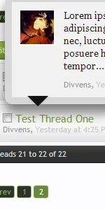
I can't seem to change the preview tooltip arrow color.
tooltipheadache.webp

Style Property Groups > Overlay and Tooltips > Preview tooltip outer and Preview tooltip inner don't seem to be changing it.
 
Here is the the CSS found in xenforo.css, the arrow color is being pulled from primaryContent.background-color under .xenPreviewTooltip .arrow span

Code:
.xenPreviewTooltip
{
    @property "previewTooltip";
    border: 10px solid @primaryMedium;
    border-radius: 10px;
    position: relative;
    box-shadow: 0px 12px 25px rgba(0,0,0, 0.5);
    width: 400px;
    @property "/previewTooltip";
   
    display: none;   
    z-index: 15000;
    cursor: default;
   
    border-color: {xen:helper rgba, @previewTooltip.border-color, 0.5};
}

    .xenPreviewTooltip .arrow
    {
        @property "previewTooltipArrowOuter";
        border-top: 15px solid rgba(3,42,70, 0.25);
        border-right: 15px solid transparent;
        border-bottom: 1px none black;
        border-left: 15px solid transparent;
        position: absolute;
        bottom: -15px;
        left: 22px;
        @property "/previewTooltipArrowOuter";
       
        _display: none;
    }
   
        .xenPreviewTooltip .arrow span
        {
            @property "previewTooltipArrowInner";
            border-top: 15px solid @primaryContent.background-color;
            border-right: 15px solid transparent;
            border-bottom: 1px none black;
            border-left: 15px solid transparent;
            position: absolute;
            top: -17px;
            left: -15px;
            @property "/previewTooltipArrowInner";
        }
 
I set it to transparent but it didn't solve the issue.

I managed to get a screenshot after several tries, the time span for when the nav tab is grey/primary color and not the set background color is very short, after hovering over the arrow to initiate the drop down it appears.
View attachment 54018

There is 3 elements there for the navTabs, I would search for these 3, the first 2 being the main ones and see if you can find that color your seeing.

Code:
.navTabs .navTab.PopupClosed:hover

Code:
.navTabs .navTab.PopupClosed .navLink:hover

Code:
.navTabs .navTab.PopupClosed .SplitCtrl
 
@Qwk86gn
Thank you so much, really, you helped me out on both the issues!

For the nav tab problem, the fix was
.navTabs .navTab.PopupClosed:hover { background-color: @primaryDark; }
Insert your color of choice.

And for the Preview Tool Tip Arrow it was
.xenPreviewTooltip .arrow span { border-top: 15px solid @primaryDark; }
Insert your color of choice.

I hope this also helps others who come across the same problem.
 
I have another question, I think this would be my last. I've got a pretty good hang of the styling system now :) Thanks to everyone.

Which is the best place I can include custom style CSS file so that xenForo loads it? I want to keep my extra.css clean for actual extra stuff and not theme related css edits. I plan to create a css for my style, infact multiple css, but where do I "include" it? PAGE_CONTAINER or include it in the main xenforo css file?
 
The style has almost come along, I've run into one minor issue.

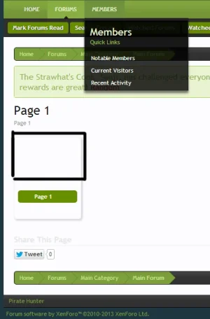
My menu links (blockLinksListitem) has text color white, because my navigation drop-down has a black background, but this is creating a problem for blockLinksListitem on page node navigation tabs;
bloclist.webp

Is there a way I can change the text color only on the page node navigation and not the menu drop down navigation? I tried;
Code:
#pageNodeNavigation .secondaryContent .blockLinksListitem { color: #000000 !important; }
#pageNodeNavigation .blockLinksListitem { color: #000000 !important; }
But both of them don't seem to be the right selectors.
 
Back
Top Bottom