Jaxel,
I have a question regarding the layout of the current Recent Threads block. I upgraded a site today from XenPorta 1.3.7 to 1.4.4. The site is using the XF default style and there are no template changes at all for XenPorta. The EXTRA.css template is clear of any changes that would affect the Recent Threads block. This is a very clean version of XF + XenPorta.
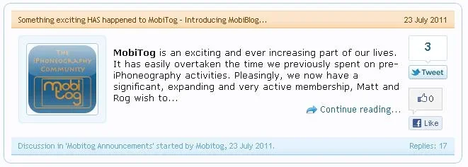
Before the upgrade (1.3.7) Recent Threads image:

It looks very clean and the look is great overall.
After 1.4.4 upgrade:

My basic question, is this the intended default look of XenPorta? Or am I somehow missing something? Specifically:
a. The "Discussion in..." has shifted in the footer area from the left to the right.
b. The "continue reading" is now in the lower right corner rather then in the article at the end of the text. When a person is reading the article it seems natural they would want the "continue reading" shortly after the last word of the article. In it's current location the "continue reading" may not be seen or used. If the continue reading was to remain there, I would suggest shifting the "Discussion in..." back to the left to save a line and give the footer a more balanced appearance.
c. The image shifted to the right side of the article. Is that by design?
d. The facebook and twitter widgets are gone. That is by design as well?
e. The indentation for the first line is huge. A normal indent is only a few characters. The indent for "As Mobitog grows..." looks like a double indent or more.

