• This forum has been archived. New threads and replies may not be made. All add-ons/resources that are active should be migrated to the Resource Manager. See this thread for more information.

[XX-Faded] [Member-card.png]

EQnoble

Well-known member
I was just playing with distortions and thought something I was doing would make a good technique to apply to a complete theme. This is the start of it.

Suggestions welcome and thank you for them.

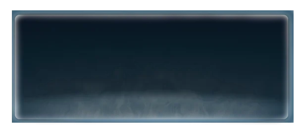
My first draft of the member-card:
member-card.webp
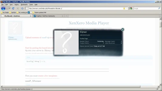
An example in use...
capMC.webp

A second combination of layers...
member-card1.webp
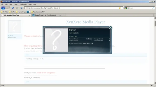
and a preview
capMC2.webp
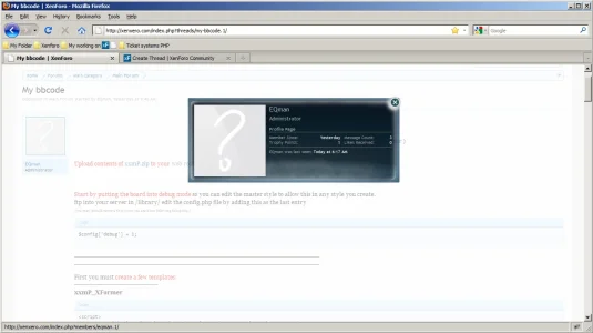
and just a quick edit to the second...
member-card2.webp
capMC3.webp

Oh well that was fun......

Now to actually design a theme I guess.
 
That looks freaking amazing. I have no argument as to why. Just a personal preference that I really like it. :)
 
That looks freaking amazing. I have no argument as to why. Just a personal preference that I really like it. :)
Why thank you kind Sir:-) Glad I got your stamp :-)

Anything that could be done different, in anyway, personal preference or generally speaking? I'd appreciate the feedback greatly.
 
It looks quite "thick" color wise - and personally I don't prefer the layer it lies in (border), but that's a personal preference, a tone update might adjust that to my personal theme - not sure what your overall site theme is where it sits within.

If I don't get your point, please rephrase :)
 
Well I'm gearing for a theme that isn't bound to one genre. Something that can be simply modified to allow anyone to use it regardless what the basis of their forum is. I personally am not developing for a specific site as my project will take quite some time and a theme is the last thing I really should be worrying about. So this venture is geared toward what works best for the most amount of people. As you are my only input thus far I will see if I can cater :-)

does this match any better?
member-card.webp
When you say thick are you saying thick as bold colors or thick as in too opaque? Or am I totally off there?
 
Thick as in dark color, not matching the style in it's overall tone.
 
You wanna shoot me some #color values, I sure I could whip something up.

In the mean time, is this any closer?
member-card.webp
member-card.box.webp
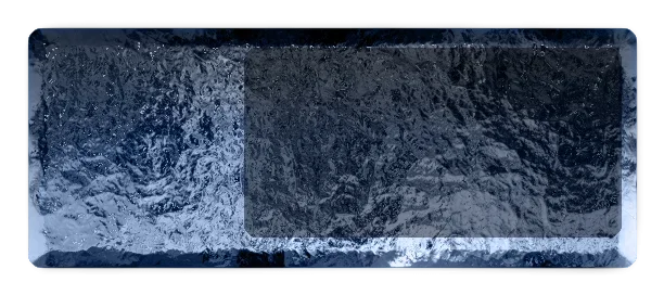
This was another test...
 
It looks quite "thick" color wise - and personally I don't prefer the layer it lies in (border), but that's a personal preference, a tone update might adjust that to my personal theme - not sure what your overall site theme is where it sits within.

If I don't get your point, please rephrase :)
Hey I re-read this and see that I failed to get your point...you liked the first one but for it to look appropriate on a test for you the hues need a changin.. (this is what my little brain thinks now....)

I was waiting for a response on some css issues and gave a color change a try
member-card-floris.webp member-card-floris3.webp member-card-floris2.webp

I think I keep failing to match your exact colors there though
 
I like the glass effect one, that i would consider using. I like the whole transperacy effect and the glass one gives the impression it is.
 
Top Bottom