Not planned XF 2.2 Please put the quick insert button (+) into the toolbar

AndyB

Well-known member
I think it will be better to put the quick insert button (+) into the toolbar. If we want to use a tool to create rich content, we should only be looking at the toolbar to select the correct tool. Also the current method of having the button appear inline on every new line is distracting and I think will get old very quick. Also on smaller screens having it float in the middle of the editor looks really bad.
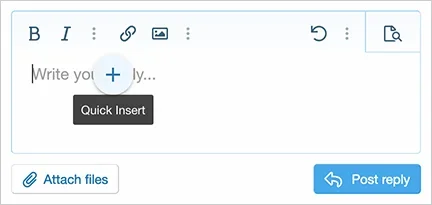
1593663769031.webp
 
Upvote 14
This suggestion has been closed. Votes are no longer accepted.
I agree with the OP. The floating action button is not meant to be for STYLING. People are expecting styling to be in the toolbar of an editor, not some flyout. This is poor user-interface design IMHO. You all are trying to simplify the editor and toolbar but instead you're breaking it apart into separate action areas now, not smart. As I've mentioned before, consider the RIBBON for a better UI. You're only going to confuse the users sadly.
 
The QI menu is meant for longer composed posts when the toolbar is out of view. Maybe some are forgetting it’s purpose.

I’m thinking place it to the left in the editor form and have it slide out when activated so it’s consistent across devices.
 
The QI menu is meant for longer composed posts when the toolbar is out of view. Maybe some are forgetting it’s purpose.

I’m thinking place it to the left in the editor form and have it slide out when activated so it’s consistent across devices.
I thought that, but the toolbar practically never does go out of view, I tried. The editor will expand to the viewport height and then stop, then you just scroll within the editable area.
 
An option for users to toggle it on and off
Most will turn it off then before they even know what it does. I mostly use my phone and couldn't even figure out what it was. On computer I did but went back on my phone and it just disappeared when clicked. It is not intuitive and yes, most users will turn it off. Perhaps it needs to be more intuitive.
 
Most will turn it off then before they even know what it does. I mostly use my phone and couldn't even figure out what it was. On computer I did but went back on my phone and it just disappeared when clicked. It is not intuitive and yes, most users will turn it off. Perhaps it needs to be more intuitive.
An option for the admin to set the default state to on or off would be handy, or just set it to off by default on install. Easier to explain once to users what it is and how to turn it on if they want to try it, than having to tell multiple people over time how to turn if off because it's annoying them on their phones or wherever.
 
If you just just look at the naming of this button in the discussions above it indicates a problem. Quick Insert "QI" yet it's not inserting anything, it's a formatting flyout. Google introduced this in Material Design as a Floating Action Button "FAB" yet this button implementation is not performing any ACTIONS. It's a poor user interface design to reduce the content on the toolbar IMHO. Hey cool, you have a floating button too, sadly, it's not what it's meant for.
 
It would be neater and cleaner (and easier for mobile users) to have it in the toolbar. Try it and see how people like it. You could always revert back if there are issues.
 
Yes please or at least an option to make it an admin option where is displays. My preference is the toolbar and not floating about.
 
It's not closed. It was just marked as Unplanned several days ago.

That doesn't mean it's too late to let Xenforo know how much we all dislike it. Unplanned or not doesn't mean it can't be changed.
 
Top Bottom