• This forum has been archived. New threads and replies may not be made. All add-ons/resources that are active should be migrated to the Resource Manager. See this thread for more information.

xenbook - a new Xenique style

Forsaken

Well-known member
I have been working on a style that I have only shown a select few over the past two months or so, and decided as I am getting closer to finishing up the design (though a release is still a month or so off due to a few things that are coming as a surprise ;)).

This style takes Facebook as a base, but the concept was to re-invent it to work well as a modern style with much more emphasis on aesthetics. You can see below the mockup (The actual style isn't ready to be viewed as there are some things being worked on that have it looking unfinished).
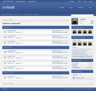
xenbook.webp

This is also the perfect chance to announce that I have recently partnered with Kim and will be releasing styles over at http://xenique.com. I will most likely be previewing a few more styles there and possibly here as well.
 
Looks really good, but what does this bring to the table? So far I can only see color changes and some other cool things that I do like, but still it looks like the default XenForo style under it all to me. Do you plan on doing anything to not make it look like that?
 
Looking nice. The blue around the avatar on the top right could be brighter imo.
It looks brighter when coded.

Looks really good, but what does this bring to the table? So far I can only see color changes and some other cool things that I do like, but still it looks like the default XenForo style under it all to me. Do you plan on doing anything to not make it look like that?

Main reasoning being that most people do not need anything more than the default XenForo style, and it is better (commercially and logically) to present a style that'll fit the main stream audience.

I have another style that'll come out sometime in December/January that'll be similar to this (based off of this style) that is focused more on of breaking out of the XenForo design, but I thought it better to put it off and get out a few unique styles before presenting one that is a real game changer. This style will also require a few custom add-ons, and I am waiting for 1.1 to be released before I can start on coding it.
 
  • Like
Reactions: Kim
I like the user area on the top right, however I am NOT a fan of the nav on the right side, with the sub nav on the left. It just seems rather... unfriendly.

It looks like a great style though, and It'll be nice to have some more styles close to home but different :)(if that made sense).

Looks great though!
 
  • Like
Reactions: Kim
Very classy interpretation of the Facebook phenomenon... you have taken a rather dull but very familiar look, and turned out a winning interpretation of it :)

I also am not in love with the Nav on the right, with the sub nav on the left.. I agree with Russ, but you know that, I told you before. I do think they should be conjoined twins myself, personal preferance and all :)

Apart from that, I love it!
 
It looks brighter when coded.

Main reasoning being that most people do not need anything more than the default XenForo style, and it is better (commercially and logically) to present a style that'll fit the main stream audience.

I have another style that'll come out sometime in December/January that'll be similar to this (based off of this style) that is focused more on of breaking out of the XenForo design, but I thought it better to put it off and get out a few unique styles before presenting one that is a real game changer. This style will also require a few custom add-ons, and I am waiting for 1.1 to be released before I can start on coding it.
Very good point, makes me want to hug you.......*runs away*.

But I can't wait to see that other style, to bad it's 6/7 months away lol.
 
I like the user area on the top right, however I am NOT a fan of the nav on the right side, with the sub nav on the left. It just seems rather... unfriendly.

It looks like a great style though, and It'll be nice to have some more styles close to home but different :)(if that made sense).

Looks great though!

I totally agree about how it seems unfriendly, but there wasn't much choice other than changing the whole feel of the design, which I couldn't do because of how I plan to release this and the add-on style.

I tried the tablinks floated to the right, as well as the sidebar and search on the left and it just didn't work out as it seemed awkward. It also wouldn't have worked with the later style. Moving the navigation was out of the question because the secondary style will need to limit vertical scroll as much as possible.

Very good point, makes me want to hug you.......*runs away*.

But I can't wait to see that other style, to bad it's 6/7 months away lol.

I have to focus on a project for Kim and myself, and then work on releasing XenMinimalism, and several other styles.

I also haven't decided if I'll do my secondary xenbook style before or after before I do my different concept series (I take a concept subject like art, and then create a style around it) as the concept series is something that'll be much more challenging.

I also have something like 55 styles (including xenbook and XenMinimalism) that are ready to be finished, coded, and potentially released.
 
Funnily enough I made a header for a xenforo style i started called 'xenbook' the other week, lol.
 
I like it. Very much so.

To be honest, I don't see why people want you designers to break out of the XF layout so much.
XF's layout is user friendly, and very attractive, imo.

I really like the userbar at the top. Reminds me of the Flexile style.

Anyway, the only thing I'm not real crazy about is the forum status icons. IMO, they're too large. If I were to use this, I'd definitely resize them.
 
Can we see a mockup/screenshot of the thread view? I'd like to see what you've done with the user info block and the message post area.

I like it so far, very easy on the eye.
 
I like it. Very much so.

To be honest, I don't see why people want you designers to break out of the XF layout so much.
XF's layout is user friendly, and very attractive, imo.

I really like the userbar at the top. Reminds me of the Flexile style.

Anyway, the only thing I'm not real crazy about is the forum status icons. IMO, they're too large. If I were to use this, I'd definitely resize them.

Because design is all about creativity, and if we were to remain true to the complete XenForo design (really can't change everything without causing difficulty for end users) everything would look similar. Default XenForo is attractive, but the goal is to make something attractive and different.

The userbar was inspired by Flexile. I actually prefer another layout for it, but it doesn't work with this style of design and would be difficult for end-users if they required modifications or mods that used the visitor tabs.

The icons will be changing as Kim pointed something out to me and I need to do some changes anyways.

Can we see a mockup/screenshot of the thread view? I'd like to see what you've done with the user info block and the message post area.

I like it so far, very easy on the eye.

I usually just do a mockup of the forum_list so I can stay consistent to that, and then go from there with the other pages.

I might be going closer to the facebook style with how they have done status updates and such, though I will probably stylize it to match this style.

Looks good, but not a fan of the repeated gradient on each forum in the list. Reminds me too much of vB4.

I actually really dislike the way I did nodes :p, but I'm trying to stay away from a similar design I've had to use on ~3 styles (Two for clients, one for my own style that I am probably releasing).

I'm looking for concepts/ideas in what to do, but things like the forum_list and a few other templates are very difficult to change and stay original or consistent.
 
Almost done with what I have to finish off before this style can be finished, then it should be ready for release sometime within the coming months (y).
 
  • Like
Reactions: Bob
I can't tell without physically using it ... but does the alert area (a xenforo triumph) feel too high up when using it ?
The only oddity I have with it is finding the admin panel link, and that is only because I usually am not working with that so never grew accustom to it.
 
The only oddity I have with it is finding the admin panel link, and that is only because I usually am not working with that so never grew accustom to it.
I like the position of the admin control panel link. It's over to the left where all the admin/mod controls are. The right side has all the member controls, as it should be.
 
Top Bottom