Implemented 'With selected' can be positioned better

Grover

Well-known member
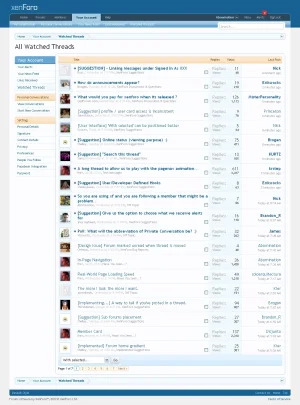
Go to: All Watched Threads in your Account

This area feels a bit scrammed together. I would expect the 'With Selected' functionality to be positioned more near the select boxes, because it has a direct relation to that. Especially when you use the fluid style, the dropdown is far away from the selection boxes.
-


with selected position.webp
 
Upvote 1
This suggestion has been implemented. Votes are no longer accepted.
I think there would be a chance of someone overlooking the form if it were aligned there.

I think its more logical where it is now.
 
That will be changing soon in order to mirror the position of our inline moderation checkboxes.
 
Thanks Nick!

(I really don't see the need to see the options on the left when simply viewing Watched Threads)
 
That will be changing soon in order to mirror the position of our inline moderation checkboxes.

Thank you! (and offtopic... -since we can not reply anymore to 'Implemented Suggestions'-threads- also thank you very much for implementing alerts for you have been quoted: fantastic social functionality! :cool:)
 
I think there would be a chance of someone overlooking the form if it were aligned there.

I think its more logical where it is now.

Overlooking? They already need to check some checkboxes and then scroll to the bottom to reach the 'With selected...'-dropdown. How can they overlook it and next to that: what is more logical then placing this dropdown right beneath the checkboxes instead of all the way to the left where it is crammed together with the page-navigation? UI functionality should be placed in context with each other.

I agree. It's good right where it is. Aren't items in a drop down usually aligned to the left?

Why should they be? It serves no purpose there on the left, because there is no context/direct relation there with the checkboxes. But... ;) I am repeating myself and I don't want to repeat my behavior I demonstrated enthusiastically on vBulletin.com for 9 years... :oops:

It's not essential, but since xenForo's UI/UX is such a pleasure already, I want to provide suggestions to keep it that way (if Mike&Kier agree it's an improvement, that is) and maybe improve it a little where possible. The UI/UX of xenForo is one of it's biggest selling points for me, and I hope a lot of other customers.
 
*Flashback* ... not only is this what I'm used to, but it's what seems to make more sense:
boxes.webp

It's pretty weird to imagine the drop-down being aligned to the left in this instance.
 
XenForo's inline moderation interface is unlike anything you have seen on a forum before. I am hoping to have a demonstration video ready tonight.

Sh*t... and I wanted to go to bed early for once in this very exciting week!
 
I'm afraid I may have to dash your hopes for tonight at least - I just uploaded a video demonstrating attachment uploading and placement to YouTube and it's horrible. It's turned my 1280x800 clip into a postage-stamp sized blur-fest and the visuals appear to be running about 3x too fast, so they don't correspond to the sound at all.

Trying Vimeo now... fingers crossed.

I already saw it when you posted it, but couldn't send the reply I wrote, cause the thread was removed ;). I get your point, but for me the video was fine:

Grover said:
I was waiting for the new videos to come up... (yes, I am becoming a xenForo groupie ;))!

I keep saying, the userinterface of this product is so well thought-out. When you as an end user are using it, it looks and feels amazingly simple, elegant and very intuitive. Oh, and I love the automatic resize of full-sized attachments when you resize your browser-window. Awesome (as Floris would say).

Not sure if you are okay with me posting it, but here is the YouTube link to the video:

(edit: I removed it myself, because maybe it's not appropriate, since Kier removed the original thread for a reason)

Awesome!
 
Top Bottom