- Home
- Forums
- Official XenForo add-ons
- Resource Manager suggestions
- Resource Manager closed suggestions
You are using an out of date browser. It may not display this or other websites correctly.
You should upgrade or use an alternative browser.
You should upgrade or use an alternative browser.
Implemented "Watch this Resource" button
- Thread starter Vincent
- Start date
This suggestion has been implemented. Votes are no longer accepted.
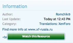
View attachment 24388
I find this better looking then the current "Watch this Resource" button.
Don't mind about the <br />
This might also be placed at the place where the download and discuss buttons are
The button needs some better border, but was too lazy.
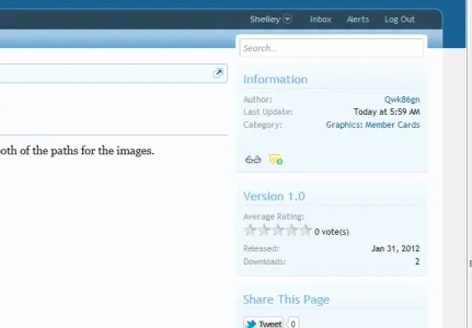
Screenshot for those interested in what it would look like.
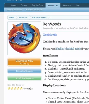
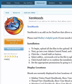
That's what I meant
Thanks Shelley!
I was thinking if it was possible to have a different color for when unwatched and watched (I'm sure you'll know what I mean), but I don't know which other color would be good. Perhaps you know?
That's what I meant
Thanks Shelley!
I was thinking if it was possible to have a different color for when unwatched and watched (I'm sure you'll know what I mean), but I don't know which other color would be good. Perhaps you know?
I think the colour is irrelevant since colours will be using pulled off the color palette and picked by the developers. It was more to show what the button would look like more than anything in this location rather than in the information block. The concern here is the amount of padding: ignore toomuch; in the buttons and if lowered to compensate and give the content more space. Plus, you'll have to hope users don't use animated avatars as the larger avatars display animations if memory recalls.
I think the colour is irrelevant since colours will be using pulled off the color palette and picked by the developers. It was more to show what the button would look like more than anything in this location rather than in the information block. The concern here is the amount of padding: ignore toomuch; in the buttons and if lowered to compensate and give the content more space. Plus, you'll have to hope users don't use animated avatars as the larger avatars display animations if memory recalls.
Hmm, that makes sense
Thanks
When I watch a resource .... what exactly am I watching and not watching.
When I watch a resource .... what exactly am I watching and not watching.
maybe the "Resource Discussions" ? but those are anyway in another thread...
so for an Add-on, you need to watch the "Resource" and also watch the "Resource Discussion" ?
This is another case of the need for merging both "Resource" and its discussions into ONE cohesive block.
Where is a blog post ?
bhrrrrrr.....
Digital Doctor is right in saying that the "RM Tabs" should be for other things like "Installation, Release Notes, Mods, FAQ, etc.".
http://xenforo.com/community/threads/resource-and-add-on-releases.26702/page-2#post-320184
Why not have those things being "Tabs" instead of having it as a "Blog"?
The link for "Read More" can easily being overlooked.
And having the current Tabs in the Sub-Navbar?
http://xenforo.com/community/thread...and-not-in-line-with-xf-easy-interface.26813/
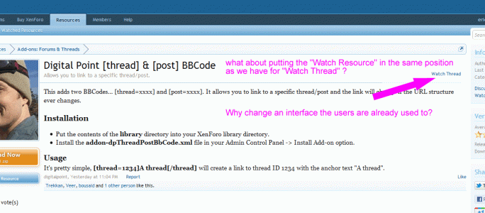
what about having the Link for "Watch Resource" in the same position as the "Watch Thread" ?
Why re-inventing the wheel and changing a clean and successful user-interface by cluttering it with some strange buttons?
View attachment 24445
I have thought about that too, but I actually found that in this context the green button would look better than the small link (My own opinion)
Personally I don't like the icon idea (below) but it shows you what it would look like with icons instead of text and gives members an idea what it would look like on the chance they suggest icons.
View attachment 24524
I also have to -1 that
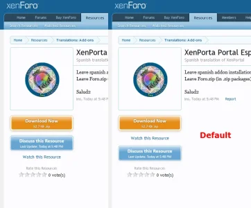
It's been moved - it is intentionally not a huge button, as we don't need to draw massive attention to it. However, it is in a much more prominent spot now, so I'm going to call this "implemented".
Before you walk away did you try it under the discuss resource button? Just that since it's not being styled like the other buttons the placement below might be better.
Similar threads
- Question
- Replies
- 2
- Views
- 2K
- Replies
- 16
- Views
- 7K
- Replies
- 17
- Views
- 3K
- Suggestion
- Replies
- 3
- Views
- 1K
- Replies
- 1
- Views
- 1K
