You are using an out of date browser. It may not display this or other websites correctly.
You should upgrade or use an alternative browser.
You should upgrade or use an alternative browser.
RM 1.0 Location of Watch this resource
- Thread starter Andy.N
- Start date
EQnoble
Well-known member
you could try adding these properties to this selector and change it how you see fit...
.resourceInfo .primaryLinks.noButton {
left: 680px;
margin-top: 1px !important;
position: absolute;
}
edit:
n/m that above...it's trash
this is what you need to override to make this happen with the most minimal changes...
edit:
n/m that above...it's trash
this is what you need to override to make this happen with the most minimal changes...
Code:
.resourceInfo h1 {
    margin-top: 17px;
}

.resourceInfo .primaryLinks.noButton {
    margin-top: 0;
}It does not make any difference. I'm using Flexile style, btwyou could try adding these properties to this selector and change it how you see fit...
.resourceInfo .primaryLinks.noButton {
left: 680px;
margin-top: 1px !important;
position: absolute;
}
edit:
n/m that above...it's trash
this is what you need to override to make this happen with the most minimal changes...
Code:.resourceInfo h1 { margin-top: 17px; } .resourceInfo .primaryLinks.noButton { margin-top: 0; }
EQnoble
Well-known member
Just on a hunch...try removing it from extra.css and adding it to the very end of the resource_view.css template like this with the !important in there
Code:
.resourceInfo h1 {
    margin-top: 17px !important;
}

.resourceInfo .primaryLinks.noButton {
    margin-top: 0 !important;
}EQnoble
Well-known member
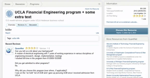
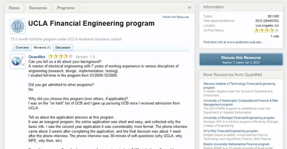
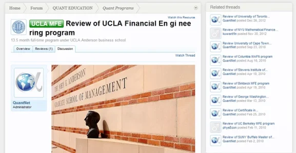
Well I did the above images with css only and the reason I did it the way I did it is it allows for the title to go end to end without interfering with the watch this resource clickable when there is a long title like the first and third images I posted.I could be wrong but I believe he wants something like this:
View attachment 44586
Of course, a longer tagline will cause it to wrap.
I would be tempted to say that a template edit and associated changes may be the best option.
I could do the same alignment you were showing with css only as well like this...
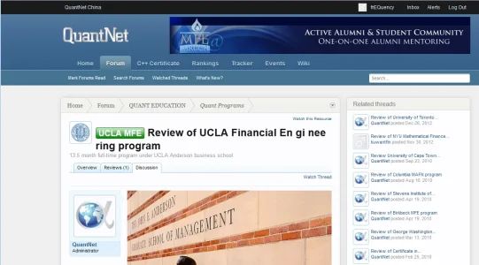
but the whole reason I put the watch resource above it was so in the event that a title was very long it wouldn't have to move the alignment of the watch clickable or end up overlapping it nor would have to deal with the length of the tagline.
My question is that how to fix the issue of the title and the avatar not align correctly. In your images, the title is a bit higher up but on my site, it was way down in middle of the avatar.I am having a hard time understanding what you want....
do these pictures describe what you want?
View attachment 44578View attachment 44579View attachment 44580
EQnoble
Well-known member
Try using this css and see if it places it how you like...mind that without this style installed with the RM I am limited to testing on the public side of your site so it may need tweaking.
Code:
.resourceInfo {
    padding-top: 10px !important;
}

.resourceInfo h1 {
    margin-top: 0 !important;
}

.resourceInfo .primaryLinks.noButton {
    font-size: 10px !important;
    margin-top: -13px !important;
}I made some minor change to the last piece of code and it seems to work really well for short/medium length title. It all works inside extra.css now (because of the !important) so it's even better.Try using this css and see if it places it how you like...mind that without this style installed with the RM I am limited to testing on the public side of your site so it may need tweaking.
Ultimately, it comes down to the length of the title which I have little control over.
Thanks again for your excellent support.
Code:
.resourceInfo {
    padding-top: 10px !important;
}

.resourceInfo h1 {
    margin-top: 0 !important;
}

.resourceInfo .primaryLinks.noButton {
    font-size: 11px !important;
    margin-top: -8px !important;
}EQnoble
Well-known member
In case you were wondering, that is why I added the space up top...without editing templates it is the only way you can do it and have it be full length like this where I added text to the title to show how I was intending it...I also thought the added space looked good up top because it more closely matches the padding to the left of the avatar.
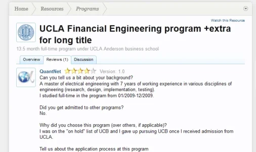

Have you checked the RM here lately?Ideally, it would stay to the right of the tagline.
Thanks. All our efforts have been wasted and answered. Love it. hahahaHave you checked the RM here lately?

The new location is perfect.
Thanks Mike.
Similar threads
- Question
- Replies
- 2
- Views
- 2K
- Replies
- 29
- Views
- 3K
- Suggestion
- Replies
- 3
- Views
- 1K
- Replies
- 1
- Views
- 1K
- Question
- Replies
- 4
- Views
- 910

