You are using an out of date browser. It may not display this or other websites correctly.
You should upgrade or use an alternative browser.
You should upgrade or use an alternative browser.
RM 1.0 Create "Discuss this Resource" button below an article
- Thread starter MrC
- Start date
You can edit the templates and move the related code to where you want.
You may need to make some CSS changes also.
A mockup of where you want it would help.
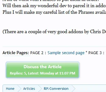
Thanks Brogan. My site is mainly articles and I have disabled reviews. It would be nice for me to have something like the attached.
Attachments
Morgain
Well-known member
Thanks Brogan. My site is mainly articles and I have disabled reviews. It would be nice for me to have something like the attached.
Mr C I agree with you and I have managed to add the button but can't style it for width and height.
The template is resource_view
Rich (BB code):
<xen:comment>ADD BUTTON TO RESOURCE_VIEW</xen:comment>
<div><xen:if is="{$thread}"><a class="callToAction" href="{xen:link threads, $thread}"><span>
        {xen:phrase discuss_this_resource}
        <xen:if is="{$thread.reply_count}"><small class="minorText">{xen:phrase replies}: {xen:number $thread.reply_count}, {xen:phrase latest}: {xen:datetime $thread.last_post_date}</small></xen:if>
    </span></a></xen:if>
</div>

<xen:sidebar>
<xen:sidebar> shows location in template.
The result is here http://www.housemorgain.co.uk/oval/resources/multiple-page-article.5/
at the bottom
I added this to EXTRA.css but no effect
Code:
/* STYLE DISCUSSION BUTTON BOTTOM OF PAGE */
.resource_view .callToAction {
margin-left:300px;
width:230px !important;
height:100px !important;
{
Brogan come back! Ja a a ke Shelley ... someone?
Shelley
Well-known member
Mr C I agree with you and I have managed to add the button but can't style it for width and height.
The template is resource_view
Rich (BB code):<xen:comment>ADD BUTTON TO RESOURCE_VIEW</xen:comment> <div><xen:if is="{$thread}"><a class="callToAction" href="{xen:link threads, $thread}"><span> {xen:phrase discuss_this_resource} <xen:if is="{$thread.reply_count}"><small class="minorText">{xen:phrase replies}: {xen:number $thread.reply_count}, {xen:phrase latest}: {xen:datetime $thread.last_post_date}</small></xen:if> </span></a></xen:if> </div> <xen:sidebar>
<xen:sidebar> shows location in template.
The result is here http://www.housemorgain.co.uk/oval/resources/multiple-page-article.5/
at the bottom
I added this to EXTRA.css but no effect
Code:/* STYLE DISCUSSION BUTTON BOTTOM OF PAGE */ .resource_view .callToAction { margin-left:300px; width:230px !important; height:100px !important; {
Brogan come back! Ja a a ke Shelley ... someone?
Wouldn't you use the following? .resource_view a.callToAction
Seems like your missing two characters
Morgain
Well-known member
Wouldn't you use the following? .resource_view a.callToAction
Seems like your missing two characters
OK yes I understand that but it's not reaching it.
Seems like the EXTRA.css is not exerting control here for some reason
I got some effect by editing direct in resource_view but much better to get EXTRA to do it.
I checked resource_view.css - it has this
Code:
.sidebar .callToAction
{
    display: block;
    text-align: center;
    height: auto;
    line-height: normal;
    margin: 15px 0;
}

    .sidebar .callToAction span
    {
        font-size: 12pt;
        padding: 3px 0;
    }

    .sidebar small.minorText
    {
        display: block;
        font-size: 11px;
        font-weight: normal;
    }
So maybe I need to add another class so EXTRA can specify it;s THIS callToAction because there's one up top and the sidebar. So waht I'm getting is generic callToAction - the sidebar one has something that says "Do this if it's in the sidebar."
Morgain
Well-known member
Shelley thank you this is reaching it now.
What's left is that the background of the button is a gradient bar which creates a border. It is getting left behind.
See http://www.housemorgain.co.uk/oval/resources/multiple-page-article.5/updates?page=1
at the bottom. Also hits the add page button at the top
It really needs a command to make this EXTRA stuff ONLY command that one button at the bottom.
Also the second line of text on the button is showing bold which doesnt match the one on the sidebar.
I tried this with no effect:
Code:
.mainContent a.minorText span {
font-size: 10pt;
font-weight: normal;
}Shelley
Well-known member
Yes thank you the height is good with auto
and the top button is now ok
shame to sacrifice the placing at centre of bottom one
but the background gradient needs a height control - despair no idea!
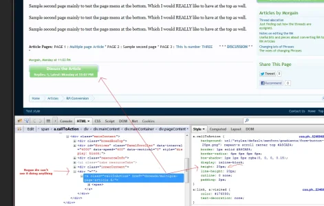
I actually had it centered in firebug. you seem to have a rogue div ""=""
the....
.mainContent a.callToAction { height: auto; } still needs applying as it's falling short at the bottom.
Morgain
Well-known member
Hmm I think that set of css on the right you show, is the main XF css for this type of callToAction button. because 20px fits the size it usually is.
Here I have the front of it responding to height: auto but not the background. have tried putting in some background controls no effect.
Also complicated by the twinning with the top instance of callToAction which governs the ADD PAGE button at the top.
Wish we could create a new class to govern just THIS bottom instance of the button not that one too.
Morgain
Well-known member
Shelley thank you yes that has sorted out the silly border.
But now the second row of text disappears - the a.minorText
Here's what I have in EXTRA,css
Weird - I tried commenting out this whole section just to see the minorText stuff return and refresh my memory - and it makes no difference whether that is in EXTRA or not. I still get your new border effect! and no minorText. I am very confused.
But now the second row of text disappears - the a.minorText
Here's what I have in EXTRA,css
Code:
/* STYLE DISCUSSION BUTTON BOTTOM OF PAGE */
.mainContent a.callToAction  span {
height: auto !important;
width: auto;
text-align: center;
font-size: 12pt;
border:1px solid #ffffff;
}
.mainContent a.minorText span {
font-size: 10pt;
font-weight: normal;
padding: 3px;
}
Weird - I tried commenting out this whole section just to see the minorText stuff return and refresh my memory - and it makes no difference whether that is in EXTRA or not. I still get your new border effect! and no minorText. I am very confused.
Shelley
Well-known member
That is odd I'm looking at the following page and seeing the height as 20px.http://www.housemorgain.co.uk/oval/resources/multiple-page-article.5/ << this is the page correct? specifically the button at the bottom?
I wonder if the class is already being used in extra.css already and some alterations your making aren't being inherted because they are being used by the button in the sidebar.
I wonder if the class is already being used in extra.css already and some alterations your making aren't being inherted because they are being used by the button in the sidebar.
Similar threads
- Question
- Replies
- 3
- Views
- 1K
- Replies
- 5
- Views
- 5K
- Replies
- 2
- Views
- 2K


