This is still in the design stages so any feedback now may be incorporated into the finial design.
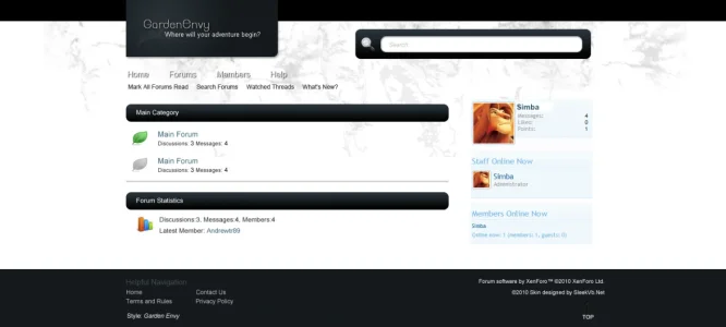
The sidebar is just a screencap of the default. The colors of the font will be changing and I am thinking of having a background design for it that flows with the template.
The theme itself has a garden/green feel with the leave post icons. I don't plan on having any other part of the template relating to this, so people can simply change the post icons and have the site matching their needs.
Skin will be available in both Fluid and Fixed (950px).
Anyways, Garden Envy:
http://sleekvb.net/img/firstlook/gardenenvy.png
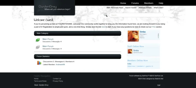
")