Lack of interest [Tweak] Move radial buttons below password

This suggestion has been closed automatically because it did not receive enough votes over an extended period of time. If you wish to see this, please search for an open suggestion and, if you don't find any, post a new one.

Cory Booth

Well-known member
For those of us in a hurry to logon, I always type my login - tab - then password - enter.
Only to realize I was ontop of the radial buttons instead of in the password field.

Its pretty standard across the board to have login/password next to each other.
 
Upvote 1
This suggestion has been closed. Votes are no longer accepted.
Feel free to change it on your own install, but the current tab index makes sense for the dual-purpose nature of the form, and I'm not inclined to change it to an illogical order to save a single tab-strike.
 
Feel free to change it on your own install, but the current tab index makes sense for the dual-purpose nature of the form, and I'm not inclined to change it to an illogical order to save a single tab-strike.
Very true, i think i need to learn to save my passwords ;)
 
Agree with Corey here, seems to me to be illogical to have it the way it is. Having said that not a biggy IMO though.
 
I am using windows in bootcamp on my mac and when i am in OSX well i do not ready want to pay for software like that any free ones?
I do not understand your sentence very well, are you saying that you do not want to pay for software you do not use often? I can tell you I use this software a lot and couldn't live without.

BTW I think it's very logical the way it is now.
 
I do not understand your sentence very well, are you saying that you do not want to pay for software you do not use often? I can tell you I use this software a lot and couldn't live without.

BTW I think it's very logical the way it is now.
I love using that app. :) Definitely makes browsing a lot easier.
 
First of all, I would like to suggest a small usability tweak in the login_bar_form Template

When you login to a website, where you're registered already, you are used to enter your username, hit the tab key once and enter your password. In XenForo this currently doesn't work. You need one more (two) tab key hits to go to the password field.

Suggested change:

Search login_bar_form for this block of code:
Code:
    <ul>
     <li><label for="ctrl_not_registered"><input type="radio" name="register" value="1" id="ctrl_not_registered" tabindex="102" />
      {xen:phrase no_create_account_now}</label></li>
     <li><label for="ctrl_registered"><input type="radio" name="register" value="0" id="ctrl_registered" tabindex="102" checked="checked" class="Disabler" />
      {xen:phrase yes_my_password_is}:</label></li>
     <li id="ctrl_registered_Disabler">
      <input type="password" name="password" class="textCtrl" id="ctrl_password" tabindex="103" />
     </li>
    </ul>

You'll see tabindex 102 used twice. Just remove them:
Code:
    <ul>
     <li><label for="ctrl_not_registered"><input type="radio" name="register" value="1" id="ctrl_not_registered" />
      {xen:phrase no_create_account_now}</label></li>
     <li><label for="ctrl_registered"><input type="radio" name="register" value="0" id="ctrl_registered" checked="checked" class="Disabler" />
      {xen:phrase yes_my_password_is}:</label></li>
     <li id="ctrl_registered_Disabler">
      <input type="password" name="password" class="textCtrl" id="ctrl_password" tabindex="103" />
     </li>
    </ul>

Second suggestion is to modify helper_login_form Template to add tabindex to username and password input fields, to achieve the same effect (one tab key hit) as above:

Search for:
Code:
	<dl class="ctrlUnit">
		<dt><label for="ctrl_pageLogin_login">{xen:phrase your_name_or_email_address}:</label></dt>
		<dd><input type="text" name="login" value="{$defaultLogin}" id="ctrl_pageLogin_login" class="textCtrl" /></dd>
	</dl>

	<dl class="ctrlUnit">
		<dt><label for="ctrl_pageLogin_password">{xen:phrase do_you_already_have_account}</label></dt>
		<dd>
			<ul>
				<li><label for="ctrl_pageLogin_not_registered"><input type="radio" name="register" value="1" id="ctrl_pageLogin_not_registered" />
					{xen:phrase no_create_account_now}</label></li>
				<li><label for="ctrl_pageLogin_registered"><input type="radio" name="register" value="0" id="ctrl_pageLogin_registered" checked="checked" class="Disabler" />
					{xen:phrase yes_my_password_is}:</label></li>
				<li id="ctrl_pageLogin_registered_Disabler">
					<input type="password" name="password" class="textCtrl" id="ctrl_pageLogin_password" />					
					<div><label for="ctrl_pageLogin_remember" class="rememberPassword"><input type="checkbox" name="remember" value="1" id="ctrl_pageLogin_remember" checked="checked" /> {xen:phrase stay_logged_in}</label></div>
				</li>
			</ul>
		</dd>
	</dl>

and change to e.g.:

Code:
	<dl class="ctrlUnit">
		<dt><label for="ctrl_pageLogin_login">{xen:phrase your_name_or_email_address}:</label></dt>
		<dd><input type="text" name="login" value="{$defaultLogin}" id="ctrl_pageLogin_login" class="textCtrl" tabindex="101" /></dd>
	</dl>

	<dl class="ctrlUnit">
		<dt><label for="ctrl_pageLogin_password">{xen:phrase do_you_already_have_account}</label></dt>
		<dd>
			<ul>
				<li><label for="ctrl_pageLogin_not_registered"><input type="radio" name="register" value="1" id="ctrl_pageLogin_not_registered" />
					{xen:phrase no_create_account_now}</label></li>
				<li><label for="ctrl_pageLogin_registered"><input type="radio" name="register" value="0" id="ctrl_pageLogin_registered" checked="checked" class="Disabler" />
					{xen:phrase yes_my_password_is}:</label></li>
				<li id="ctrl_pageLogin_registered_Disabler">
					<input type="password" name="password" class="textCtrl" id="ctrl_pageLogin_password" tabindex="103" />					
					<div><label for="ctrl_pageLogin_remember" class="rememberPassword"><input type="checkbox" name="remember" value="1" id="ctrl_pageLogin_remember" checked="checked" /> {xen:phrase stay_logged_in}</label></div>
				</li>
			</ul>
		</dd>
	</dl>
 
Well, looks like I have to disagree with the developers on this topic. :)
This is clearly a usability flaw.
People quickly get used to common workflows and it's not a good idea
to change the workflow without very good reason, especially at the
"entrance" of a community. ;)
 
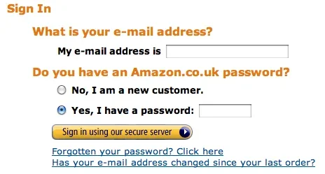
As posted in that thread, it's the same way Amazon do it so people presumably already are used to it?
 
No, it's not ;)
Try it on your own @ Amazon.
The design is similar, but the form requires one tab key hit only to proceed to the password field!
 
Fair enough, I don't use Amazon so I was going off the screenshot.

As both threads are about the same thing, I've merged them to avoid the discussion being split.
 
Thanks Brogan for joining the two threads.
You can delete post #18 because it's pretty much the same as post #17. :)

Let me reiterate, that I don't suggest to move the radio buttons
but to fix (change) the tab order for usability reasons.
 
Top Bottom