You are using an out of date browser. It may not display this or other websites correctly.
You should upgrade or use an alternative browser.
You should upgrade or use an alternative browser.
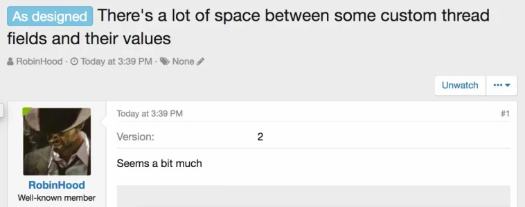
As designed There's a lot of space between some custom thread fields and their values
- Thread starter RobinHood
- Start date
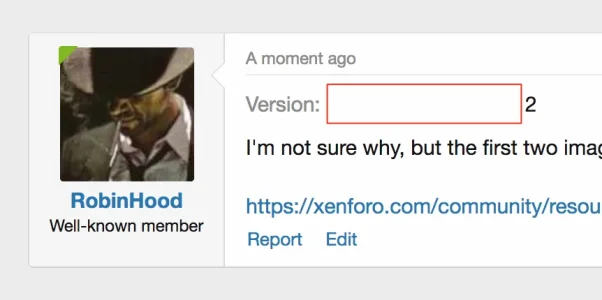
It's not really, though clearly it looks it with a particularly small title. The spacing is identical to the fields here: https://xenforo.com/community/resources/sandbox-paypal.5132/ It's also the same here: https://xenforo.com/community/members/martok.46288/#about
As such, this is really going to be as designed. The only real alternative would be to not try to align them, though with multiple fields that's likely to look terrible.
As such, this is really going to be as designed. The only real alternative would be to not try to align them, though with multiple fields that's likely to look terrible.
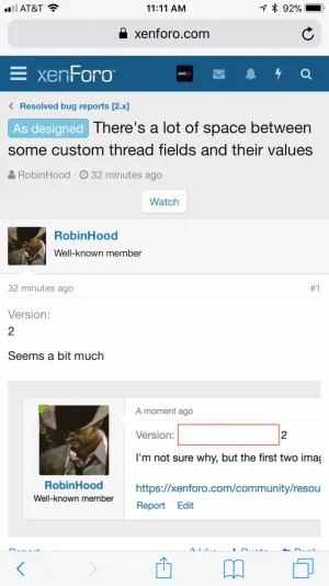
There is (or there will be) additional spacing between fields when they flip to the vertical display that should make it clearer. Our forms (and form row styled elements) have flipped to a vertical arrangement since older versions of XF1 and I don't think there's been an issue with that.
It's not really, though clearly it looks it with a particularly small title. The spacing is identical to the fields here: https://xenforo.com/community/resources/sandbox-paypal.5132/ It's also the same here: https://xenforo.com/community/members/martok.46288/#about
As such, this is really going to be as designed. The only real alternative would be to not try to align them, though with multiple fields that's likely to look terrible.
Ah, I see, perhaps it could do with the grey line break between the custom field and the text part of the post? As per the resource page.
It would help give a little differentiation between the two parts of the post.

The only real alternative would be to not try to align them, though with multiple fields that's likely to look terrible.
Actually this looks like a bug to me as a user.

would not aligning things that only have 1 custom field solve this issue ?
Xenforo 1 used this alignment method on the dual login/sign up

Is it going to be a common use of custom thread fields to have just one per thread ?

