Hi everybody, we have seen a lot of requests for a light skin and I'm very happy to announce that our first light skin is out and ready for purchase 
All of the info. can be found here and all of our skins will run off of and include our custom framework.
** UPDATE (6-25-11): Second lighter version included free **
This skin is now included free as a second lighter option when you purchase the Lucent skin!
Here are the live demo links for V2 updated version:
Lucent 2 fixed width
Lucent 2 fluid width
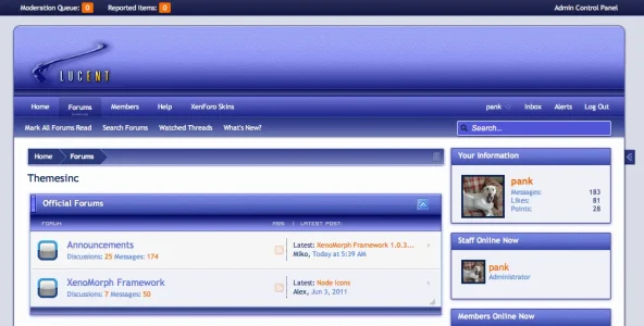
V2: Front page:
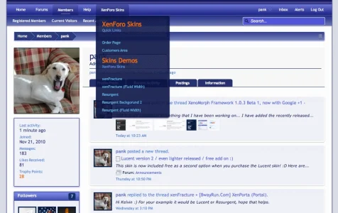
V2: Profile page:
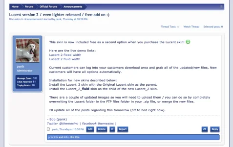
V2 Postbit page:
Version 1: Live Demo links:
Fixed width version:
Fluid version:
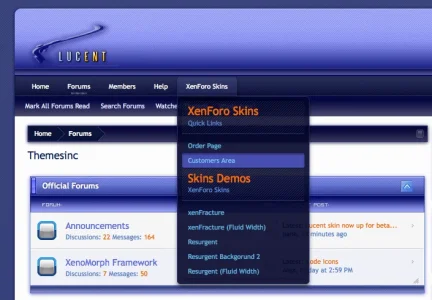
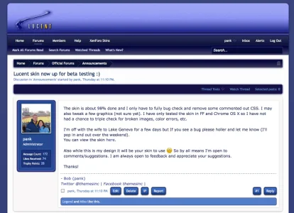
Here are a couple of screen shots of the Lucent skin:
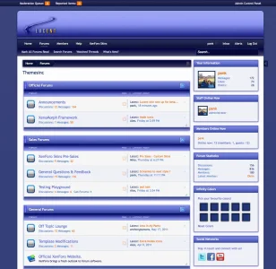
V1 Front page:
V1 Drop downs:
V1 Postbit area:
Please feel free to fully explore the skin and play with all the custom XenoMorph framework options (especially the Infinity colors)
And once again I truly want to thank the entire xenForo team for giving us all an extremely well done forum platform to use!!!
That's it, Enjoy!
All of the info. can be found here and all of our skins will run off of and include our custom framework.
** UPDATE (6-25-11): Second lighter version included free **
This skin is now included free as a second lighter option when you purchase the Lucent skin!
Here are the live demo links for V2 updated version:
Lucent 2 fixed width
Lucent 2 fluid width
V2: Front page:

V2: Profile page:

V2 Postbit page:

Version 1: Live Demo links:
Fixed width version:
Fluid version:
Here are a couple of screen shots of the Lucent skin:
V1 Front page:

V1 Drop downs:

V1 Postbit area:

Please feel free to fully explore the skin and play with all the custom XenoMorph framework options (especially the Infinity colors)
And once again I truly want to thank the entire xenForo team for giving us all an extremely well done forum platform to use!!!
That's it, Enjoy!