Implemented The position of key buttons next to the breadcrumb

Grover

Well-known member
I am gonna to have a break from XenForo in the time to come. I just want to put the following in the limelight, because I feel it is or will become an issue when using XenForo. I think XenForo is (almost) perfect when it comes to the UI/UX, but I feel this could need some attention before XF becomes Gold.

I am talking about the position of key buttons like [Post New Thread] or [Search Threads and Posts] next to the breadcrumb. I believe this is a fundamentally wrong position and I will show why I think that.

[Search Threads and Posts]
First, there is this example about the [Search Threads and Posts]-button:
http://xenforo.com/community/thread...ics.2082/#post-30259

The [Search Threads and Posts] button there is more or less unrecognizable as a button that should be pressed to get more search options. It gets overlooked, very understandably, by endusers. To prevent it from being overlooked, it has to be put more into the viewpoint of the enduser. And that means... as close to the information-area as possible, there where the eye-focus of the enduser is. Meaning: in the center of the screen (right above the search input fields for example), not somewhere in a corner where it is not visible/clear/intuitive enough.

[Post New Thread]
The same problem occurs when users need to post a New Thread, as pointed out by Shanj in the following discussion where a visual example is posted in:
http://xenforo.com/community/thread...ead.2538/#post-41403

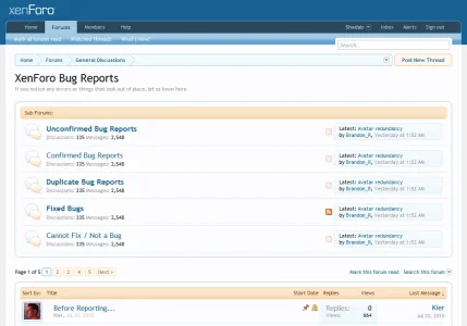
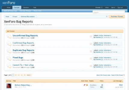
Needless to say that this can become obviously problematic. I don't know how XenForo displays multiple subforums underneath each other, but I could imagine it would be like this:

wrong position of key buttons in XF.webp

I believe a good UI should make it as easy/intuitive as possible to post a thread. Posting threads is THE BASIS of forums in the first place. That's why I find it a bit remarkable that XenForo puts the KEY button for this in a really counter-productive and non-intuitive position. A button with such an importance should be placed right there where the focus of the endusers-eye is, the moment he/she wants to post a new thread. And that is as near to the existing threadtitles as possible.

Those are my last constructive suggestions I will put out for a while (XF is near perfect in it's UI/UX for me). Hopefully M&K can share a part of this vision and re-think a bit the positions of those key buttons. I believe it will make XF better.

Keep up the good work (developers + community) and see you again after XF Gold's release!

Grover.

Please do [like] this first posting if you think it is a good feature suggestion for XenForo
 
Upvote 15
This suggestion has been implemented. Votes are no longer accepted.
I think perhaps grover has a point but ONLY for the sake of existing users of forums because they have been preconditioned to the location of such buttons.

That said however, the new thread button did take me a while to discover and you have to cater for people like me or I'll cry.
 
Yes it took me AGES to find it. I thought my membership was in some kind of newcomer status and I couldn't start a thread - I was waiting for an email to say my registration was completed.

Then one day I found it. I was not very happy about that delay!
Methinks som e will not bother ....
 
The buttons next to the breadcrumb require restyling to make them more distinct, but I'm sticking with the placement until we have evaluated their visiblity with the updated style.
 
The buttons next to the breadcrumb require restyling to make them more distinct, but I'm sticking with the placement until we have evaluated their visiblity with the updated style.

Thanks Kier for the info.
I do want that new thread button moved west though. For a Western right hander (the majority) it's intuitive to look left for key controls. Stuff on the right feels like extras or options rather than basics.
 
[...] button there is more or less unrecognizable as a button that should be pressed to get more search options. It gets overlooked, very understandably, by end users.
I agree that these call-to-action buttons placed to the right of breadcrumbs are not outright obvious. Although the design and location of the buttons is quite consistent with the design & layout; they blend into the design so much that we don't really take notice of it.

Changing their location would be one possible solution. Ensuring that it's consistently placed on multiple pages (like forumdisplay, thread pages, conversations, etc) is important.

If changing the location is difficult, then the buttons can be made to stand-out in their current position when looking at the overall page. This can be easily achieved by changing the colors of the button: background, text color, text shadow, etc. I experimented with the shades of orange that are prominent in the xenForo design, making the button's colors same as that of the quote box:

CallToAction_Buttons.webp

Something like this would be in contrast to almost everything else in the header as shown in the mockups attached below. And they don't really look terrible. :)
 

Attachments

  • CallToAction_State1.webp
    CallToAction_State1.webp
    49.3 KB · Views: 49
  • CallToAction_State2.webp
    CallToAction_State2.webp
    49.1 KB · Views: 44
The picture in post #1 scares me. I could easily have 10 subforums, under a forum where posting is allowed. The new thread button would be quite far from the threads.
 
The buttons next to the breadcrumb require restyling to make them more distinct, but I'm sticking with the placement until we have evaluated their visiblity with the updated style.

Thanks very much to look into it! For me, XF is already near perfect when it comes to the UI, except this (for me obvious) issue of these key buttons being placed outside of the context of user processes.

I do want that new thread button moved west though. For a Western right hander (the majority) it's intuitive to look left for key controls. Stuff on the right feels like extras or options rather than basics.


I agree that these call-to-action buttons placed to the right of breadcrumbs are not outright obvious. Although the design and location of the buttons is quite consistent with the design & layout; they blend into the design so much that we don't really take notice of it.

^this remark of Shadab is very clearly explaining the issue.

Changing their location would be one possible solution. Ensuring that it's consistently placed on multiple pages (like forumdisplay, thread pages, conversations, etc) is important.

If changing the location is difficult, then the buttons can be made to stand-out in their current position when looking at the overall page. This can be easily achieved by changing the colors of the button:

Although this is in itself already an improvement indeed, it is still something that tries to 'work around' the fundamental misplacing of those buttons. Changing the colors does make them more visible, but in both my examples it would still not solve the issue of the buttons not being placed there where they belong: as close to the context of user processes.

Oh well that's me stuck with a template edit to put it at the centre.

In both my examples I am afraid I have to do the same. It is not such a problem for [Reply to Thread] (a third example) for instance, because we have a 'Reply' link on every single posting. And we have the QuickReply box beneath the thread. But in the 2 key examples above... the [Post New Thread] and [Search Threads and Posts] buttons are the ONLY way to access important functionality. Key functionality that is: posting new threads is the core of a forum. And searching for those threads is obviously also essential functionality.

I am looking forward to Gold.
 
That's along the lines of what I was thinking about, Shadab, though I would use a gradient and some shadowing to make them look extra-buttony.
The new button looks good.
smile.png


Although I'd prefer if the hover states were reversed:
ie, light background by default, and a darker background on hover.
 
FWIW, I did originally have the hover state reversed, but it was nowhere near noticeable enough.
Seriously, this is the final design for that button? :( Oh well, it can't be 100% awesome all the time.
Sorry to sound so negative about it.
 
The old button didn't look like a button. What would you suggest?
The problem that I have with it isn't so much that the old one was better, they were obviously not clear enough - as known - but the new ones look like a copy paste from a web site that offers free css buttons.

It's like you go to Steve Jobs with the Android and he goes 'great prototype, now let's make this into an Apple product'. The button isn't "xenforo" - you didn't quite 'nail it' just yet.

I'd have to try a bunch of things out before I can just go 'this is what I would do', but currently while it does stand out more, it feels like it is either too much, too dark, or just doesn't feel xenforo, for me personally, it just feels like a step back actually.

I will spend some time on this tonight and see if I can come up with something.
 
The old button didn't look like a button. What would you suggest?
As a test, can you try it with the hover state reversed but use a darker colour instead of the very light blue?

Perhaps the same blue as in the 2nd level menu bar #65A5D1 ?

Edit: D'oh! Ignore me, it already is.
 
This is the current CSS - what changes do you want to see?

Code:
a.callToAction
{	
	display: inline-block;
	
	line-height: 20px;
	height: 20px;
	
	background: white;
	border-radius: 6px;
	border: 1px solid @primaryLight;
	padding: 2px;
	
	box-shadow: 0px 2px 5px rgba(0,0,0, 0.2);
	outline: 0 none;
}

	a.callToAction span
	{
		padding: 0 15px;
		
		display: block;	
		border-radius: 3px;
		background: @primaryMedium url('styles/default/xenforo/gradients/form-button-white-25px.png') repeat-x center -7px;
		
		font-weight: bold;
		font-family: @button.font-family;
		font-size: 11px;
		
		color: @textCtrlBackground;
	}
	
	a.callToAction:hover
	{
		text-decoration: none;
	}

		a.callToAction:hover span
		{
			background-color: @primaryLightish;
		}
	
	a.callToAction:active
	{
		box-shadow: 0 0 3px rgba(0,0,0, 0.2);
		position: relative;
		top: 2px;
	}
 
Top Bottom