Not planned Tab Order at Login, Signup

Safin

Member
Would it be possible to separate the "Create Account" with the "Login" tab order on the "Log In or SignUp" container box that opens when you are browsing as guest.

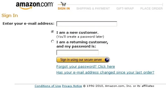
By default, right now the tab order is "Your Name or Email", after which is the field about whether you want to create an account or have an existing password, and then is the password field. So basically after typing the username, you have to hit the tab key twice to enter your password as against only once on most sites(if not all). Imo, we are so accustomed to typing the username/password via tabs that it leads to a bit of confusion (or hitting enter without entering the password)

I suggest changing the order to how its default on most sites and actually demarcating the "Sign Up" in a separate block in the same container to the right of the login. It will also be more visible and eye catching that way.
 
Upvote 8
This suggestion has been closed. Votes are no longer accepted.
I am used to typing in my username, then hitting tab to type in my password. With xenForo, the way it is set-up as both a login and register screen, I can not do this. It would be great to change this before final release.
I've also merged your thread with the original suggestion related to this.
 
By putting both the login/register option in one interface in order to maximize the usefulness of the login, it may have created a somewhat of an annoyance to active, returning members.
 
I can think of one scenario at least where this could easily make "Identity Theft" easier.
On some of my PCs, other family members, employees, lots of other people use my computer.

If they went to a site I use, say xenforo, and they clicked "Sign up" ... they would be automatically sent to the Login Box, with my passwords saved. They could log in to that site and masquerade as me.

The "easy fix" to this "security problem" is to have "Sign Up" direct someone to the Registration Page. After All, that is what they wanted to do .. Sign up. Instead xenforo conveniently harvests my cookie password for them.
 
I'd love to hear why Mike thinks the non-standard awkward registration method in Xenforo is a good idea.

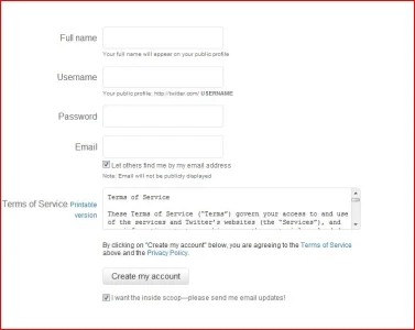
I still think the xF implementation of this is not good. And many will change it to make it much easier. If we can get something like what twitter has, it will be more beneficial for sites.

signup.webp

Very simple and to the point. No need for Full Name of course. Three input boxes or maybe one more for email verification would be enough.
 
Well ... of course xenforo has this ...

The problem is ... when a user clicks Sign Up ... they are awkwardly sent to Login Dropdown.
and NOT the Signup page.
 
I understand the problems stated above, but if you use a shared login you wouldn't store passwords on your browser anyway... that is ridiculously stupid for any website, not XenForo in particular.
 
if you use a shared login you wouldn't store passwords on your browser anyway... that is ridiculously stupid for any website
Of course it is best not to save passwords on public computers.
I am sure many people find themselves logged into sites from stored cookies.
Prevention is key.

But that doesn't justify the quirky Login / Registration.

Why should I be directed to the Login when I clicked Sign up ?
 
Of course it is best not to save passwords on public computers.
I am sure many people find themselves logged into sites from stored cookies.
Prevention is key.

But that doesn't justify the quirky Login / Registration.

Why should I be directed to the Login when I clicked Sign up ?

Nowadays, many people have their password saved. This is a security threat if somebody has their passwords saved. By trying to be innovate here it's actually causing a bigger problem. I hope the login/register forms can be re-designed to something user friendly.
 
If I have moused to the log-in panel and clicked on the username input box, I want to be able to enter my username then TAB then my password. This isnt working due to radio controls taking focus after a TAB.

I don't really want to have to type my username, pick up the mouse, move to password box, click, then enter. Bad flow
 
So you don't want to hit Tab twice. Got it.
I hear you, that wears me out too.

Let me suggest a more helpful reply: "You might not have noticed, but all you need to do is TAB twice and you are focused on the password input"

Shelly, thx. Keep in mind new users, new members and their interaction in a new community. Yes, it might become second nature to you guys, I mean, us guys, but it is not consistent with de-facto standard logins.

Therefore I stand by my proposed change
 
Let me suggest a more helpful reply: "You might not have noticed, but all you need to do is TAB twice and you are focused on the password input"
I thought that was obvious.

Sometimes I get so involved in saving lives that I forget that one person's obvious is another's unsolvable riddle. I sincerely beg your forgiveness, and promise to behave in a more holiday-appropriate manner from now on. At least until Jesus' birthday week is over.
 
Top Bottom