Styling the new Nav Bar login button

Neil E.

Active member
I used Jake's cool overlay template change to modify the login location. I also removed the big Sign Up Now! Button. Now I want to add some dazzle to the new button. I'd like it's boundary to be fully inside the nav bar with a background color of ~red with a hover color of ~green, and have rounded corners.
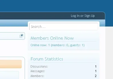
xenforo25.webp

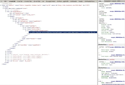
I know a CSS change (addition?) is required, but don't know how to create it. Here is what I get when inspecting using Firebug:
xenforo27.webp

I believe I read the style chart from the bottom up to see what is assosciated with the button. The top of the list is the highest priority. I want the new changes to apply to this button only. Once logged in, the button is gone and the visitor tabs are there with their normal attributes.

What should I be working with? Do I add more CSS to .navlink? Should it become #navlink? I'm trying to understand how this process is accomplished and how to make sure changes don't get inherited by other elements (or how it should be done if they need to be inherited).
 
You need to give that tab its own class:

Rich (BB code):
<li class="navTab loginSignup PopupClosed">
	<a href="logout/" class="navLink visitorTabItem OverlayTrigger">Log Out</a>
</li>

Then you can add a definition to EXTRA.css:

Code:
.navTab.loginSignup
{
	background-color: red;
}

.navTab.loginSignup:hover
{
	background-color: green !important;
}
 
Background info: Our current topic is carries on from here (new button works great).
http://xenforo.com/community/threads/change-login-bar-to-an-overlay.29219/page-2#post-382832
Now I want to style the new button.

Jake, this latest styling change didn't work for me, although I probably did it wrong. I wound up with a new button labeled "Log Out" placed right after the Help tab (it did change colors). I tried something else just to see what would happen and got a result that let me grab a screenshot of what I'm looking for. I added the red text

<xen:if is="!{$visitor.user_id}"><ul class="visitorTabs"><li class="navTab loginSignupPopupClosed"><a href="{xen:link login}" class="navLink visitorTabItem OverlayTrigger">{xen:phrase log_in_replace}</a></li></ul></xen:if>

and tried a matching css change (just experimenting to try and learn more). Here is what I did:

From the navigation template:

search
Code:
        <!-- no selection -->
        <xen:if is="!{$selectedTab}">
            <li class="navTab selected"><div class="tabLinks"></div></li>
        </xen:if>
       
    </ul>
   
    <xen:if is="{$visitor.user_id}"><xen:include template="navigation_visitor_tab" /></xen:if>
</div>
 
<span class="helper"></span>
           
        </nav>   
    </div>
</div>

replace
Code:
        <!-- no selection -->
        <xen:if is="!{$selectedTab}">
            <li class="navTab selected"><div class="tabLinks"></div></li>
        </xen:if>
       
    </ul>
   
    <xen:if is="{$visitor.user_id}"><xen:include template="navigation_visitor_tab" /></xen:if>
 
    <xen:if is="!{$visitor.user_id}"><ul class="visitorTabs"><li class="navTab [COLOR=#000000]loginSignup[/COLOR]PopupClosed"><a href="{xen:link login}" class="navLink visitorTabItem OverlayTrigger">{xen:phrase log_in_replace}</a></li></ul></xen:if>
 
</div>
 
<span class="helper"></span>
           
        </nav>   
    </div>
</div>


From the navigation.css template:

search
Code:
.navPopup .sectionFooter .floatLink
{
    float: right;
}

replace
Code:
.navTab.loginSignupPopupClosed
{
    color: black;
    background-color: red;
}
 
.navTab.loginSignupPopupClosed:hover
{
    background-color: green !important;
}
 
.navPopup .sectionFooter .floatLink
{
    float: right;
}

Resulting screen capture of what's needed:
xenforo28.webp

I want to do a full styling ie. text color, background color, borders etc.
 
Looks correct to me. You've got the new tab placed like you want with its own CSS class. You have used the CSS class to color the tab. You can of course add other CSS attributes to define a border and whatever else.
 
Top Bottom