• This forum has been archived. New threads and replies may not be made. All add-ons/resources that are active should be migrated to the Resource Manager. See this thread for more information.

Stylephase, give me feedback!

darrell

New member
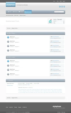
One of my latest, looking for idea's and feedback. ;)

stylephase_xenforo.png


edit: Upload field resized it. ^ full view.
 

Attachments

  • stylephase_xenforo.webp
    stylephase_xenforo.webp
    37.9 KB · Views: 143
Looking good. A suggestion; too much space between the breadcrumb and navigation and the user avatar space there doesnt feel right. Personally I prefer more fixed headers so maybe you move it above the search field?

Good luck!
 
The colour scheme I love. Like laztrix I'd move the breadcrumb closer to the navigation, and also I feel the sub-nav is a little too far below the nav. Other than that, I love it!
 
Thanks! :p

I'll have to do some adjusting on the breadcrumbs and such.
The avatar space is due to my actual used Avatar being a transparent background, if an avatar like your's for instance (laztrix) it would fill the space to around a 5px border-line.
 
Very web 2.0. Looking nice.

Right below the nav bar, part with the user box "welcome darell", I think there's too much white space there. The forum is quite far below its almost like 2 separate things.

I'd like to have a little clearer definition of each forum's space. Perhaps a darker outline and some border-bottom.
 
@Allan, haven't much decided on that one yet, will let you know. Thanks :)

@Panupat, I totally agree, had a few plans for the far left side of the white space, but honestly I was hoping for a lot more feedback & ideas on what could possibly be put there (or maybe totally do without the whole thing?) Was highly considering making it a Notification section, when there are notification's at least.
The reason for it mainly is that there is a very user-friendly Landing Page aside from the Forum theme, was trying my hardest to squeeze that section in if at all possible.
I'll work on the separation. ;)
 
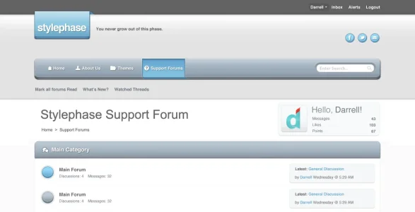
hmm maybe something like this? The breadcrumb was taking a lot of space for what it offers. And combining it with the main and secondary navigation bars, boxes and bars are getting a little redundant up there. Using plain text breadcrumb might help. More breathing room, less repetition.

Notification might fit in that spare space, to the right of watched threads above the welcome darrell.
 

Attachments

  • stylephase.webp
    stylephase.webp
    27.3 KB · Views: 82
Wow the best style for XF i have seen. Great work. Keep it up, and if you ask me, i think its great the way it is.
 
Odd... I've never seen any other style here with the same design pattern :rolleyes:. If that isn't original, I don't know what is.
 
Sure. It's not so easy to find something original in these days. This doesn't mean that there aren't professional designers around or that their design are bad obviously ;)
 
Top Bottom