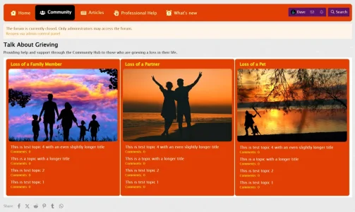
This is a proposed new forum layout - feedback?

Davyc

Well-known member
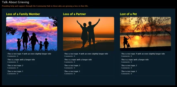
This is a new forum layout that I'm testing, which is based on a page node that will link into individual forums - replacing the traditional forum list.

Each block is a clickable image, below is a widget for the latest posts - all clickable and accessing the relevant topics pertaining to that forum.

It's formed from HTML code and an external CSS system - thoughts and feedback are welcomed.

Desktop view (there will be another row of forums below this initial one):
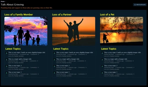
1726588124450.webp

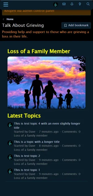
This is the mobile view:
1726588269714.webp

Thoughts?
 
That’s great. The only problem is unread content is not highlighted, I did that on a forum I had but I left because of that.
 
The unread content will be visible once you enter the forum relating to the image. There will also be the traditional list of topics. This is just a front and not instead of. For example, when you click the image, it will take you to a list of topics within that forum with all the usual features.

1726589234141.webp

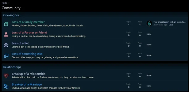
There will also be the 'NEW' tag indicating new content has been added. It's a replacement for this:

1726589308664.webp
 
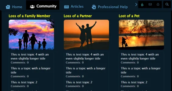
I forgot to mention that the traditional navigation menu will always be at the top of the page for additional sections and of course the 'What's New' section.
1726589913016.webp
 
I would remove the Latest Topics widget titles, it's redundant. Or at least I would make it more discreet, they have the same display as forum titles.
And I would also remove the forum title under each discussion title, it's no longer necessary in your case.
 
Is the Loss of a Family member correct here? (I'm guessing you're just using the same forum as it's a test btw)

category.webp

But I'd remove that area either way since the name is at the top and it just takes up space.
 
Is the Loss of a Family member correct here? (I'm guessing you're just using the same forum as it's a test btw)
Yeah, I just wanted to test the look, each block will have its own widget. I've not decided whether this will be topic's or posts. I could incorporate the forum title into the graphic, saving a little space. Not only that, but I can also get rid of the 'latest topics' title and even remove all the text below the topic, such as 'started by' etc. It's currently in the idea formulation stage to just give the site a different cosmetic feel away from the traditional forum list.

I've not tried this in mobile landscape mode, it is fully responsive using a grid layout, so I image it would adapt as expected. I've removed the page for now to do some more work on it, but will keep this page updated as and when I make changes. I appreciate all the feedback, very helpful :)
 
The blue on dark blue is very hard for me to read.
This will be changed to white in a later update, as will most text on the dark background. Some lighter colours will be used to highlight different points that differentiate from other texts. This is a modified default theme that still needs a little work thrown at it :)
 
My only criticism would be to hide the "bookmark" button added to Page nodes with CSS.

It could imply that they're bookmarking it on their device, when the action is bookmarking it on the Xenforo forum.

Other than that, it's pretty clean.
 
Latest update:

Gone: Bookmark Button
Gone: Breadcrumbs
Gone: Latest Comments title
Gone: Avatar on topic title
Gone: Date/Time
Gone: Forum indicator
Changed link colours to white
Changed Comments text size slightly and improved text contrast

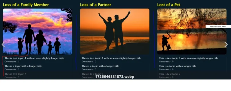
1726646881873.webp

Any or all of the 'Gone' can be put back, as most of these were simply commented out in the macros template without affecting other parts of the site. The others were removed using targetted CSS.

Mobile view landscape:

1726647315726.webp

Thoughts?
 
Last edited:
Thoughts?
Now, I feel like I'm only nitpicking here.

But, I would remove the borders around the threads (red) and add a line that's about 75% the height of the box, but vertically centered.

Quick mockup.

1726647350470.webp

The link color of the thread title should also stand out too. It blends in with the Comments too much to think it's "clickable" at first. Perhaps, the yellow or a variant? Underline? Hover?
 
Now, I feel like I'm only nitpicking here.
I don't mind 'picky' as all comments, thoughts and opinions all add to the betterment of what's on display. Another set of eyes can see things that would otherwise be missed, so your comments are appreciated.

Update:
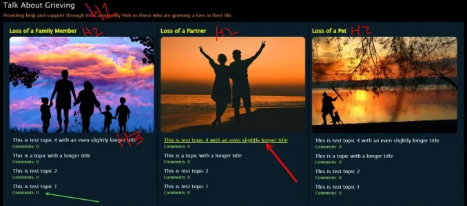
Border break between columns added, it's currently 2px width but can be increased if a larger break is required.
Comments are now in green, as indicated by the green arrow; this can be changed to any color required.
Topic titles highlight to yellow and are underlined on hover, as shown by the red arrow; this can also be changed to suit in basic colors.
Border surrounding the topics removed.
Padded reduced slightly.
Forum titles are now H4 as opposed to H3 previously, so slightly smaller.

1726653339139.webp
 
It looks much better than when you first posted.

I'm not too deep into semantics on HTML headings, but it would make sense for the threads to be H3, but the font-size changed to be the same as H4 (that size).

1726660349903.webp

Someone with more SEO experience would have to correct me if going from H1 to H2 to H4 would have any-if at all-impact on how your site is viewed.

After that is addressed, I would go over color schemes that are more fitting to your site. I think the darkness is not quite what someone wants to see after they've lost someone. Perhaps pick up the tones to something brighter or more relaxing and blend those together; set their mood with your colors.

One 2020 study that surveyed the emotional associations of 4,598 people from 30 different countries found that people commonly associate certain colors with specific emotions. According to the study results:2
  • Black: 51% of respondents associated black with sadness
  • White: 43% of people associated white with relief
  • Red: 68% associated red with love
  • Blue: 35% linked blue to feelings of relief
  • Green: 39% linked green to contentment
  • Yellow: 52% felt that yellow means joy
  • Purple: 25% reported they associated purple with pleasure
  • Brown: 36% linked brown to disgust
  • Orange: 44% associated orange with joy
  • Pink: 50% linked pink with love
Source: https://www.verywellmind.com/color-psychology-2795824

We also covered colors in Marketing (undergrad & grad), and touched on them in Psychology (undergrad requirement), so there is something to them.

While you did use blue, it's a very dark shade of blue. I would consider changing colors to ilicit a more positive emotion to drown out what your users might be feeling.
 
I would go over color schemes that are more fitting to your site.
Yeah, the color scheme will come later, I'm wanting to get the layout right first. One of my friends is a psychologist, so I will be working with him to get the colors as right as possible. Appreciate the links, will go through this with him and we should end up with something more palatable for the aims of the site.
 
  • Like
Reactions: frm
Yeah, the color scheme will come later, I'm wanting to get the layout right first. One of my friends is a psychologist, so I will be working with him to get the colors as right as possible. Appreciate the links, will go through this with him and we should end up with something more palatable for the aims of the site.
Looks good from widgets. That must've taken a lot of time. Congrats on getting it down to almost a final draft.

That's the last thing I had to add as I know how long that must've taken!
 
OK I'm almost ready for deployment, but I'm at a crossroads with the color schema, so these are the three options I'm considering and your thoughts and comments on each would be appreciated along with the one that appeals most to you. It's never easy deciding on colors, as they are a subjective issue, with everyone liking different colors. However, the colors used for this site need to be as right as they can be for the majority.

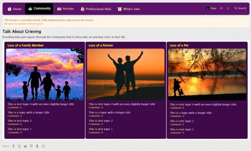
Option 1:

1726738198989.webp

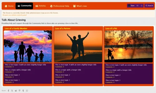
Option 2:

1726738224745.webp

Option 3:

1726738252973.webp

The colors are very easy to change so take a good look and let me know which appeals to you the most. I will add that both orange and purple are indicated to be the most relaxing colors from a psychological point of view. They can be lightened and darkened, so what you see can be considered to be the foundation with wiggle room for tweaking. The other point to think about is that not all screens will show colors the same depending on their settings for brightness, contrast, saturation and other factors.

With thanks in advance for your help.
 
Back
Top Bottom