You are using an out of date browser. It may not display this or other websites correctly.
You should upgrade or use an alternative browser.
You should upgrade or use an alternative browser.
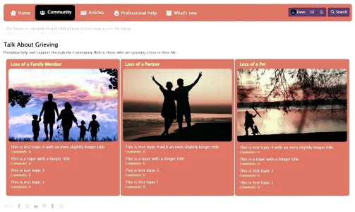
This is a proposed new forum layout - feedback?
- Thread starter Davyc
- Start date
D
Deleted member 184953
Guest
I would remove the white block behind and add padding between node blocks, let them breathe !
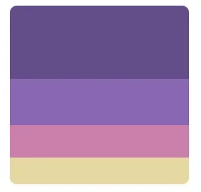
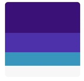
Off topic, but where did you grab these color swatches?I really think the colors clash. But that's me.
I typically just eyeball colors with the Photoshop color selector. Pre-defined swatches like this would save some time for sure as I could directly use them or use it as a better starting point.
But, it's all coming together great @Davyc. A lot would be hard pressed to tell that's a Page node already over a custom "light" add on.
Oh I’m about to learn you something beautiful.Off topic, but where did you grab these color swatches?
I typically just eyeball colors with the Photoshop color selector. Pre-defined swatches like this would save some time for sure as I could directly use them or use it as a better starting point.
But, it's all coming together great @Davyc. A lot would be hard pressed to tell that's a Page node already over a custom "light" add on.
Search Google for “Color Palettes”.
As simple as that sounds, I never thought to do that.Oh I’m about to learn you something beautiful.
Search Google for “Color Palettes”.
Used to be a big thing when colorlovers came out like 10 years ago. Iirc they were the trendsetter of color palettes.As simple as that sounds, I never thought to do that.
And to imagine, as a hobbyist photographer, knowing the color wheel, I did not know web-color swatches like this existed for web design. I suppose I should've assumed since the hardware store has them.Used to be a big thing when colorlovers came out like 10 years ago. Iirc they were the trendsetter of color palettes.
This will help styling as I can key in on the exact colors instead of a color picker move-adjust-select one.
I'd recommend @Davyc go over these to see the exact colors to fit tones perfectly.
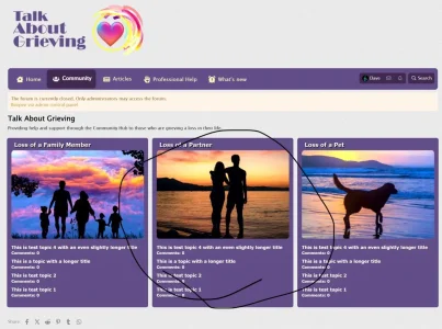
OK, I've decided to go with a pastel purple as it's classed as a spiritual color as well as a color that balances emotions.
Changes:
Removed white border
More spacing between columns
Changed text on headings to white and applied shadow (CSS)
Change font family to a more legible type and made white
Change font weight
Made all text and topic links white
Changed page backgrounds to that of a paper graphic
Now showing with the logo

I just need to add the other forums, add links, add individual widgets and change the navigation to suit.
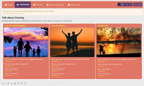
This is the front page seen on entry to the site.
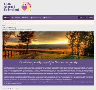
Changes:
Removed white border
More spacing between columns
Changed text on headings to white and applied shadow (CSS)
Change font family to a more legible type and made white
Change font weight
Made all text and topic links white
Changed page backgrounds to that of a paper graphic
Now showing with the logo

I just need to add the other forums, add links, add individual widgets and change the navigation to suit.
This is the front page seen on entry to the site.

D
Deleted member 25216
Guest
These sites may be helpful when deciding colour palettes to use.

 coolors.co

 colorkit.co


Trending Color Palettes - Coolors
Get inspired by thousands of beautiful color schemes and make something cool!

ColorKit - Color Palettes, Gradients, Inspiration, and Color Tools
For artists and designers, bring your designs to life with our collection of online color tools and color palette inspiration.

30 Refreshing Color Palette Ideas for Your Website
The right color palette for your website can set you apart from the crowd. Check out these custom-made color combinations to choose your website colors.
www.shutterstock.com
I would remove the shadow and make the font weight heavier and size a bit bigger.Changed text on headings to white and applied shadow (CSS)
Shadow text on flat backgrounds gives me year 2000 vibes.
If you're going to shift from flat UI to flat UI "2.0", the shadows would look much better on the navigation and content blocks.
I'd play with either dotted underline or underline and compare that to shadows, with bolder and larger text.
Looks lovely mate!OK, I've decided to go with a pastel purple as it's classed as a spiritual color as well as a color that balances emotions.
Changes:
Removed white border
More spacing between columns
Changed text on headings to white and applied shadow (CSS)
Change font family to a more legible type and made white
Change font weight
Made all text and topic links white
Changed page backgrounds to that of a paper graphic
Now showing with the logo
View attachment 311182
I just need to add the other forums, add links, add individual widgets and change the navigation to suit.
This is the front page seen on entry to the site.
View attachment 311183
I've actually made the text smaller to ensure that it plays nicely on mobile devices - too large and line breaks come into play, and I'm not generating more CSS for @media commands to make changes; in fact I need to trim the external CSS files as there is a lot not used in them, but I need to be both careful and judicious and may incorporate them into the extra.less template which is already at 231 lines, but that may increase as I look at other aspects of the site.I would remove the shadow and make the font weight heavier and size a bit bigger.
I'm also thinking of adding @Bob Blog add-on, so people can create their own journals and keep a record of their journey.
The font weight is already at 600 - heavier, and it kind of blurs the text as characters blend together. I'm fond of shadows, that may be a throwback from my latter days when I was designing for print, lol. But I appreciate that not everyone likes them.
I would prefer to keep the purple as the surrounding areas are already very light, and I wanted to use a contrasting color to focus the eye. When you see it on a live site, it looks so much better than those blurry screenshots. As I mentioned, colors are subjective - I discussed this with my psychologist friend, and he suggested purple for its calming properties. But I wasn't sure which blend until you posted those swatches, and I liked the pastels.Although if I may give one suggestion. Change the purple into white/light gray.
I'll be changing the images that accompany each section, they were just grabbed at random for fillers whilst testing; this will be another arduous task to find the right sympathetic balance.
Plenty more to play with and think about. I need to generate the rest of the forums and widgets, and then start adding content. It's been fun and I appreciate all your thoughts and comments, they have helped me tremendously; not to mention helping make everything look better. I'll keep you posted on how things progress
Looking forward to the launch. I know journaling can be of great help in instances like this.I'm also thinking of adding @Bob Blog add-on, so people can create their own journals and keep a record of their journey.
This is a pretty unique idea that I think can be very beneficial. I'll pass it on to the military family members I still connect with when it's up so they can try public journaling their loss (as opposed to private) and see if connection helps more, or if they can just set it to private and scream into the void, whichever would help them the most. I know they do Facebook groups for that, but it's really not the same as writing 1000 words about the first moment "he" opened the door for them and how little of a gesture they miss, rather short "I miss X today" and "I'm here for you" kind of replies (there's really no good anonymity either).
Looking good though. I think you got it from here.
Good luck!
D
Deleted member 184953
Guest
I hope you won't use the same avatar in your new forum! 
Frankly, I have never found it logical that the last message in each forum appears on the main page. I think no one can remember what was written in which forum. For this reason, I would say reconsider showing the last topics / messages.
In terms of colour, I would try tones of green.

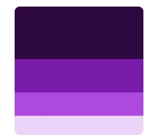
I suggest you try this palette.
In terms of colour, I would try tones of green.

I suggest you try this palette.
