Style Style Feedback Needed

Amaury

Well-known member
Hey, all!

So it's been a while since I've released a style on here, and so I was hoping I could get some feedback on my latest before I officially release it. The style is called Easter Sunday (I know, I'm late), and this is actually the first time I'm requesting feedback. The reason is because even I'm not sure if it turned out good. I'm not sure if it's me or if this holiday is just a hard thing in general to turn into a style.

Here's a screenshot:
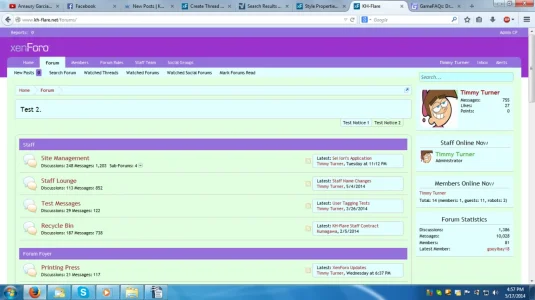
upload_2014-5-17_16-57-30.webp

What would you change?

Thanks in advance!
 
Last edited:
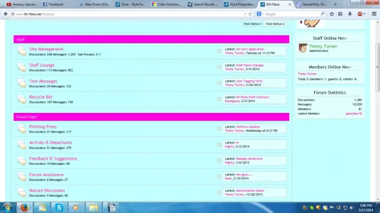
To be honest, the colors do not flow at all. Ever tried something like this? http://colorschemedesigner.com/

Thank you for the feedback.

vBulletin had a color picker tool, and to be honest, I could never get to work with me just right, so I never really used it. I just ended up tweaking things until they looked just right, but I wasn't able to do that with this style because I just couldn't find the right combinations. xD

What if I used the same color scheme I had on the vBulletin version I made? Blue and pink. It was something like this:

upload_2014-5-17_17-9-37.webp

If not that, any recommendations? What if I did pink / purple for the headers and white for the backgrounds in general?
 
Last edited:
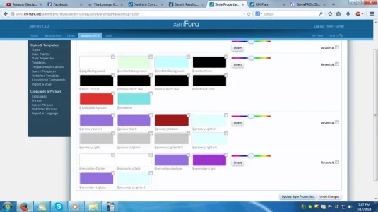
I reverted back the edits I made for the last screenshot, and if it's of any help, here's the color palette:
upload_2014-5-17_17-19-4.webp
 
Last edited:
You asked for feedback not recommendations.
The colors you are using dont fit together, thats the opinion of some here around.
If you want remcommendations we could start doing the style ourself
There is no need to be that "currish" all time. If you dont like the answers you get dont ask for any.
Really gettin annoying with you

If you're going to come in here and be rude, then you can just leave. There's a difference between critiquing and just outright being rude. Also, I did ask for recommendations / suggestions. Specifically:

What would you change?
 
I'm sorry, I wouldn't use a site with those colors.

Can't really give feedback on changes because I'd delete it and start from scratch. You should probably do some research on modern website design. This looks like an old geocities design.
 
I'm sorry, I wouldn't use a site with those colors.

Can't really give feedback on changes because I'd delete it and start from scratch. You should probably do some research on modern website design. This looks like an old geocities design.

No need to be sorry. That's what this thread is for: constructive feedback. :)

I set up my styles in such a way that I can completely redesign them without having to start from scratch. I have everything pulling styling from the color palette, so gimme about 30 minutes to an hour to fiddle with things and see if I can make it look more appealing. :)

That might be part of the problem. I find that solely using the color pallete doesn't provide me enough control.
 
Should try giving it something to stand out, I noticed you like to keep with simple changes in color, but sometimes you need to add a little extra for people to really look at the styles.

Maybe work with some css edits, like shadows, text transforms, etc. Just something to make your styles stand out some.

I can add text transformations, but I personally dislike shadows. I don't know why.
 
Yeah it's not for everyone lol, but yeah experiment with different things, look up css examples for things and attempt to incorporate edits that will work great for a style and not break it or irritate people using it.
 
Top Bottom