OK, I'm really struggling to come up with any sort of logo for the site redesign so in desperation I'm turning to you lot to have a laugh at my expense provide some constructive criticism.
It's for a motorsport site, focussed mainly on Formula One.
The site name relates to the line a driver must take around a corner for the fastest time; i.e. clipping the apex (http://en.wikipedia.org/wiki/Racing_line).
I've settled on the font so that's a definite, only took 3 days too...
The colour is also definite so that won't change.
As for the logo itself though, I can't seem to come up with anything other than plain text, a bit of shadow and some variations related to the initial letter "C".
So without further ado, this is what I've got so far:
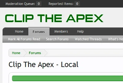
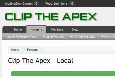
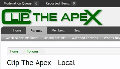

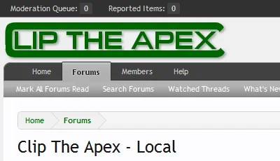
The main problem is whenever I do anything with the "C" it becomes disassociated from the rest of the text and the wording looks like "lip the apex" which would obviously be undesirable, not to mention rather painful...
I like the idea of the last one as it implies a race track, albeit an oval.
So do your worst
It's for a motorsport site, focussed mainly on Formula One.
The site name relates to the line a driver must take around a corner for the fastest time; i.e. clipping the apex (http://en.wikipedia.org/wiki/Racing_line).
I've settled on the font so that's a definite, only took 3 days too...
The colour is also definite so that won't change.
As for the logo itself though, I can't seem to come up with anything other than plain text, a bit of shadow and some variations related to the initial letter "C".
So without further ado, this is what I've got so far:


The main problem is whenever I do anything with the "C" it becomes disassociated from the rest of the text and the wording looks like "lip the apex" which would obviously be undesirable, not to mention rather painful...
I like the idea of the last one as it implies a race track, albeit an oval.
So do your worst
