You are using an out of date browser. It may not display this or other websites correctly.
You should upgrade or use an alternative browser.
You should upgrade or use an alternative browser.
Soft Responsive [Deleted]
- Thread starter Arty
- Start date
Would adding a width setting under 'Responsive Header and Navigation' for the logo help?Right. I'll have to re-think whole header situation then
Normally that problem would be solved by adding overflow:hidden to logo container, but in 1.2 that would hide search popup, so that's not an option.
So eg can keep 'Header and Navigation with no width set (So it shows right full screen), but in 'Responsive Header and Navigation' add a width so it centers right in mobile views?
Think this might be due to xenporta (what btw as a 1.2 version, its been posted within the discussion for the addon) but videos via the media bbcode don't resize on the portal, what adds a big gap down side.
Think this might be due to xenporta (what btw as a 1.2 version, its been posted within the discussion for the addon) but videos via the media bbcode don't resize on the portal, what adds a big gap down side.
Code:
iframe
    {
        display: none;
    }
        .baseHtml iframe
        {
            display: block;
            max-width: 100%;
        }
Edit: That broke the editor :|
Edit: Fixed using: .newsText iframe { max-width: 100%;}
Last edited:
Arty updated Soft Responsive with a new update entry:
Update for Xenforo 1.2 RC 2
Read the rest of this update entry...
Update for Xenforo 1.2 RC 2
Style has been updated for XenForo 1.2 RC 2 (not much to update, almost all bugs fixed in 1.2rc2 were already fixed in style) and issue with centering logo should be fixed now.
Install xml file in admin control panel to update style. No need to replace any files.
Read the rest of this update entry...
@Carla Birch There is a new option to center logo separate from logo width. It (and changes in code) should solve logo problems.
Confirmed, it's fixed@Carla Birch There is a new option to center logo separate from logo width. It (and changes in code) should solve logo problems.
I also see you fixed the login button hiding menu also via new settings
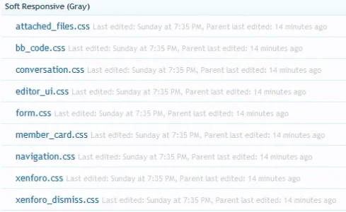
Bugs that were fixed in 1.2 rc 2 in those templates were already fixed in this style in beta 1/2, so there was nothing to update. I did save those templates without changes just to bump version number to remove them from outdated templates list, but seems it didn't work.
Just ignore that list for now. I'll edit those templates again in next version to remove them from outdated list.
Just ignore that list for now. I'll edit those templates again in next version to remove them from outdated list.
Any plans for a dark version of this? If not, how difficult would it be to get something along the lines of the Class theme?
http://www.audentio.com/preview/xenforo/class
http://www.audentio.com/preview/xenforo/class
Any plans for a dark version of this? If not, how difficult would it be to get something along the lines of the Class theme?
http://www.audentio.com/preview/xenforo/class
He has said that Black Responsive is a week or two away from being updated.
http://xenforo.com/community/resources/black-responsive.1649/
Bottom borders: apply that change I posted above to remove image, add border radius to #headerMover:Top borders are very tricky because dark background is covering white background, not other way around. It can be done by adding 2 absolutely positioned boxes to each top corner: one with dark background, one with white background covering it and border radius for corner. Add this to extra.CSS:Code:#headerMover { border-bottom-left-radius: 5px; border-bottom-right-radius: 5px; }Code:#navigation { position: relative; } #navigation:before, #navigation:after, #navigation nav:before, #navigation nav:after { display: block; content: ''; position: absolute; top: -10px; left: -15px; width: 5px; height: 5px; background: #53777A url('@imagePath/xenforo/layout/pattern.png'); } #navigation nav:before, #navigation nav:after { left: auto; right: -15px; } #navigation:after { border-top-left-radius: 5px; background-color: @pageBackground; } #navigation nav:after { border-top-right-radius: 5px; background-color: @pageBackground; } @media only screen and (max-width: 1060px), only screen and (max-device-width: 1060px) { #navigation:before, #navigation:after, #navigation nav:before, #navigation nav:after { display: none; } }
Hi Arty,
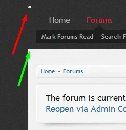
You helped me out about a year ago with the question I just quoted; now I'm trying to do something a little different. How would I go about rounding the area with the green arrow?

You're awesome, thanks
Hi Arty,
You helped me out about a year ago with the question I just quoted; now I'm trying to do something a little different. How would I go about rounding the area with the green arrow?
View attachment 52123
You're awesome, thanks
Side note, this looks like Class because I'm borrowing elements I like and incorporating it into this theme. I own licenses to both Soft Responsive and Class


