John, the king of xF dark stylesI have picked up this gorgeous design and will be developing it for XF...stay tuned")

John, the king of xF dark stylesI have picked up this gorgeous design and will be developing it for XF...stay tuned
Potential customer hereI have picked up this gorgeous design and will be developing it for XF...stay tuned
")
WHOA! Congratulations, Mr. John! Hopefully you bring it to a whole new level!John, the king of xF dark styles
1 thing I dislike about XenForo skins.... They're either all dark (black mostly) or all light (white or gray).So I have another skin design in the works that depends heavily on CSS3 and HTML5. It's my iteration of what a light theme should be; light, powerful, and beautiful. Previews to come soon. (ETA - Friday)
1 thing I dislike about XenForo skins.... They're either all dark (black mostly) or all light (white or gray).
The only design here someone did this
https://www.phpbb.com/customise/db/style/cerulean/demo/sid_b855550910cd77b4d229184b8e19ddc3
With this
https://www.phpbb.com/customise/db/style/cerulean/#colorizeit-editor
(click on Change Colors)
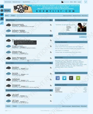
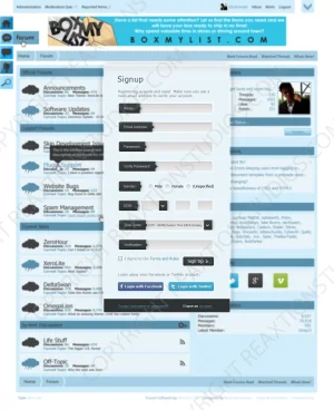
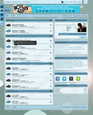
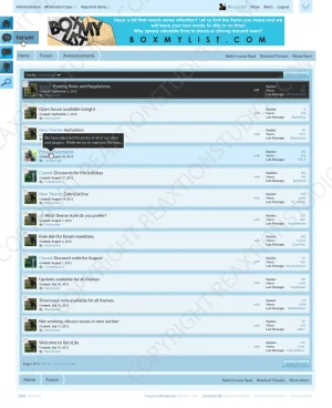
Okay folks, I have this installed on my site live now, You can view it here. Look forward to your feedback.
Hi Shelley, thanks for the feedback! The breadcrumbs are intentional as well as the font size of the node descriptions (based on the original design). I agree with the suggestions on the node icons and node stats, though, thanks!
We use essential cookies to make this site work, and optional cookies to enhance your experience.
")