Lack of interest Small Member Card Suggestion

This suggestion has been closed automatically because it did not receive enough votes over an extended period of time. If you wish to see this, please search for an open suggestion and, if you don't find any, post a new one.

Amaury

Well-known member
This is simply trivial, but it can't hurt to suggest it. :)

Depending on the number of messages and likes you have, the text Likes Received and the number of likes received can end up on separate lines, which doesn't look too well, in my opinion.

My suggestion is to move Likes Received down a line. Plus, it would make it even: two things on the top (Member Since and Messages) and two things on the bottom (Likes Received and Material Points).

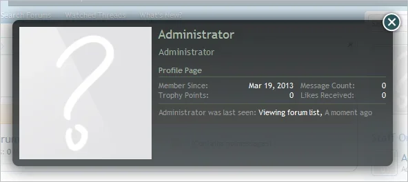
XenForo Example - Same Line:

JVlegCX.png


KH-Vids Example - Separate Line:

OP1d4ky.png
 
Upvote 0
This suggestion has been closed. Votes are no longer accepted.
Bear in mind the approach to the member card has changed in 1.2 due to the responsive support.

Having said that, I don't see what the second image is supposed to be showing - it looks the same to me.
Content will automatically break onto a new line if there isn't enough width.
 
Bear in mind the approach to the member card has changed in 1.2 due to the responsive support.

Having said that, I don't see what the second image is supposed to be showing - it looks the same to me.
Content will automatically break onto a new line if there isn't enough width.

It's showing the number of likes received on a separate line from the text Likes Received compared to first one.

My suggestion is move the text Likes Received down a line so we don't have to worry about not enough width making the number of likes received be on a separate line.

For example, this is how it is currently:

Member Since: X Messages: X Likes Received: X
Trophy Points: X

However, if there's not enough width like in the second screenshot, it does this:

Member Since: X Messages: X Likes Received:
X Trophy Points: X

My suggestion would do this:

Member Since: X Messages: X
Likes Received: X Trophy Points: X
 
That's how it used to be.

upload_2013-6-24_21-1-38.webp

It was changed due to content breaking out of the bottom of the member card, especially if multiple add-ons hook into it.
 
That's how it used to be.

View attachment 49778

It was changed due to content breaking out of the bottom of the member card, especially if multiple add-ons hook into it.

Hm. That's kinda close to what I'm suggesting

My suggestion is keeping the white space between each text the same like it is in the current version. Looking at the image you provided, I see big white space between each thing -- for example, between the text Member Since and the join date, there's a big white space.

My suggestion would look like this, courtesy of Paint editing:

8sEpajf.png


The text size and font would match the rest, of course. This is just an example of what it would look like.
 
To be honest, I can't see it changing back to how it was, and if it did, it would make sense to separate it into two neat columns rather than have everything just next to each other.

What happens when add-ons start adding to the content?
How and where do you decide to split onto the next row?
 
To be honest, I can't see it changing back to how it was, and if it did, it would make sense to separate it into two neat columns rather than have everything just next to each other.

What happens when add-ons start adding to the content?
How and where do you decide to split onto the next row?

But I'm not suggesting it to go back to the old way? I see the old way had the content text like the join date aligned to the right. Is that what caused the issues?

What do you mean by your second question? Additionally, how exactly does it now, then?
 
Last edited:
I know.
As I have said though, once you start including add-ons which hook into it then there is the potential for the content to be pushed down too far due to too many rows being used, which was why it was changed to how it is now.

Of course it's not such an issue from 1.2 as the member card no longer has a fixed size background image.
 
Top Bottom