Flash uploading - and yes it does have issues. I'll try it without Flash.
You are using an out of date browser. It may not display this or other websites correctly.
You should upgrade or use an alternative browser.
You should upgrade or use an alternative browser.
Simple Gallery [Paid] [Deleted]
- Thread starter Robbo
- Start date
Hi, yes I noticed that, it links to the same page though. The only thing wrong with this mod is that it's not, for me at least, appearing in the menu. Hoping Robbo fixes it soon.There is a tiny tab between Forums and Members. It isn't labelled.
Seems OK now, however it doesn't show the image preview when uploading.Flash uploading - and yes it does have issues. I'll try it without Flash.
Try with a different browser etc. It might be an issue just from your computer.Seems OK now, however it doesn't show the image preview when uploading.
Tried in IE, FF and Chrome, image preview does not work.
Also, how do we get a cover image on a video item? http://www.bigfooty.com/forum/album/afl-fails.3/
Also, how do we get a cover image on a video item? http://www.bigfooty.com/forum/album/afl-fails.3/
That's weird. Can you get someone else to try on another computer?Tried in IE, FF and Chrome, image preview does not work.
Also, how do we get a cover image on a video item? http://www.bigfooty.com/forum/album/afl-fails.3/
There is meant to be a default image, you will find it in style/default/merc/simple-gallery I think. Copy it into your custom style. This however will be changed soon, work has started on the next update, if I get it in you will be able to upload a cover image per video and also select which image from an album is used for the whole albums cover image.
Here is a preview of the current gallery index for global. Basically 1.1/2 will be focused on the global albums like you have already just with more features. 2.x will be basically a complete seperate facebook styled user albums (photos etc) section.
The reason to show this perview is that currently you can set display order on albums and I am asking if anyone actually want this because in the screens you can see ordering is decided by the user.

The reason to show this perview is that currently you can set display order on albums and I am asking if anyone actually want this because in the screens you can see ordering is decided by the user.
Yes to all.Very nice,
Future Simple Gallery is Media Gallery, isn't it?
Will current customers of Simple Gallery be upgraded to Media Gallery?
I think a thumbnail view without the clutter would be a popular choice.

Newer galleries don't show one tiny image on the left and a huge blankness to the right.
Galleries created from forum communities all seem to want one "line" per image.
If you want to display details use hover over or make them click the image.
The images, not usually useless details, should be front and center.
It's rare to see a gallery made in the last 5 years not have just Thumbnails view.
Thumbnails should be the default view.
IMO.
R
ragtek
Guest
agreeI think a thumbnail view without the clutter would be a popular choice.
View attachment 32635
Newer galleries don't show one tiny image on the left and a huge blankness to the right.
Galleries created from forum communities all seem to want one "line" per image.
If you want to display details use hover over or make them click the image.
The images, not usually useless details, should be front and center.
It's rare to see a gallery made in the last 5 years not have just Thumbnails view.
Thumbnails should be the default view.
IMO.
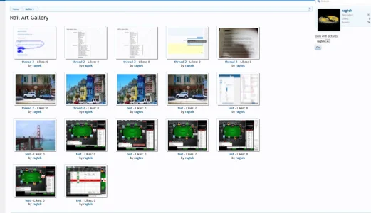
i've done the same
Attachments
That's much better.
I'd go the full nine yards
- get rid of all text (name, likes, author).
- and put them closer together.
Like instagram
Like the iphone gallery

For some reason all those images with less space is much more visually appealing.
R
ragtek
Guest
no suggestions pls
that's a custom gallery addon, which is "exactly" how the custom wanted it (how i was able to code it )
)
so it's a finished story and no competitor addon:d
that's a custom gallery addon, which is "exactly" how the custom wanted it (how i was able to code it
)so it's a finished story and no competitor addon:d
Thumbnails are the default view. God. This is a prototype and shows one of the views you can have. Wait until the add-on is like at least in alpha before dumping images everywhere please. People who have contributed to the funding will get their say anyway and it will look how they want it. It will probably end up having a fair few different view options.
Current one just makes thumbnails cropped to the center of the image. Future versions will do it more like facebook where it makes the sizes and you can choose where it crops.Simple Gallery can resize images during the upload process?
If you upload larger (by width and height) images, by default it automatically (do no actually resized but) scaled them to 800px × 600pxSimple Gallery can resize images during the upload process?
I guess, It won't reduce file size currently. But in the future Media Gallery you can expect that with a lot more thingsOh ok, I didn't explain the objective of my idea of the "resize thing", it was something related to reduce the size of the files on the server.
")
View attachment 31937
Trying to upload an image and the page just sits there with the activity bar blinking. Image is only 98kb in size.
I got exactly same situation with this. After successfully uploading 2 images, I attempted upload one 7 MB image without success. Since then image of any size can't be uploaded. :-(