You are using an out of date browser. It may not display this or other websites correctly.
You should upgrade or use an alternative browser.
You should upgrade or use an alternative browser.
Serif or sans serif font?
- Thread starter calorie
- Start date
Sans serif because it is easier to read online.
sans serif ... looks more modern.
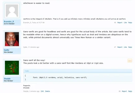
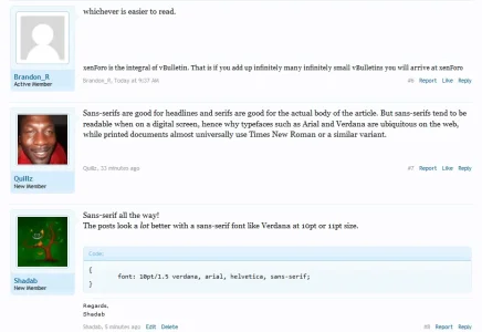
Sans-serifs are good for headlines and serifs are good for the actual body of the article. But sans-serifs tend to be readable when on a digital screen, hence why typefaces such as Arial and Verdana are ubiquitous on the web, while printed documents almost universally use Times New Roman or a similar variant.
I voted for 'doesn't matter' because, for me, it's up to personal preference. If I was creating a site for my self, which I wanted to implement a lot of typography effect - then the main body would be a Serif font, simply because I like them a lot. However, if I was working with a client who wanted mainly Sans-Serif, then I would use it because it's what they prefer. If they were going for usability, rather than design effect, then who can blame them? It doesn't really matter and there is no 'best' among them. They both have their positives and negatives. As I said above, it's all about personal preference (as most options with design tend to be.)
Sans-serif all the way!
The posts look a lot better with a sans-serif font like Verdana at 10pt or 11pt size.
Code:{ font: 10pt/1.5 verdana, arial, helvetica, sans-serif; }
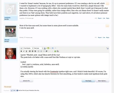
I'm actually viewing the board with the Constantia typeface right now, and I think it looks beautiful. Of course, I'm using Mac OS X, which also has Quartz Extreme for font smoothing, so that tends to make most typefaces look quite nice.
Attachments
I'm actually viewing the board with the Constantia typeface right now, and I think it looks beautiful. Of course, I'm using Mac OS X, which also has Quartz Extreme for font smoothing, so that tends to make most typefaces look quite nice.
Constantia is probably one of my favorite fonts.
Lets revive a thread from the dead shall we?
So what are people current thoughts on this? It seems like the majority prefer sans serif. I'm considering switching one of my sights away from the default to a sharper looking sans-serif.
I'm not sure what stack to go for though.
So what are people current thoughts on this? It seems like the majority prefer sans serif. I'm considering switching one of my sights away from the default to a sharper looking sans-serif.
I'm not sure what stack to go for though.
Has anyone considered using any google web fonts for the standard message text? With fall backs to a more standard stack.
If so, any suggestions on which of the 500 to experiment with?
Any reason why it wouldn't be a good idea to use web fonts?
If so, any suggestions on which of the 500 to experiment with?
Any reason why it wouldn't be a good idea to use web fonts?
SilverCircle
Well-known member
Serif for better readability (yes, there is a reason why it's still the favorite font for print publications).
The reason why they are not so popular on screens is that they require a higher quality level of anti aliasing and smoothing to make them look really good. You need sub-pixel XY smoothing and high quality fonts (= not Times New Roman, because it's poor) to get nice looking serif letters. Clear type, for example, is exceptionally bad at it, OS X is a bit better and if you want to see how font rendering should be done, look at Adobe products. They've mastered something that is a lot more complex than most people think.
Modern technologies (think retina-quality displays and better text-rendering like DirectWrite) will contribute to better overall web typography and will hopefully allow us to get away from the ugly standard Verdana/Tahoma/Arial look.
Here are two interesting articles about font rendering in general. They get very technical, but explain the common problems of font rendering and why Serif fonts often look worse than they actually should.
http://www.antigrain.com/research/font_rasterization/index.html
http://www.basschouten.com/blog1.php/font-rendering-gdi-versus-directwrite
Cheap displays with low quality panels are another factor and many people would be surprised how much better text can look on a high quality display. Take the iPad for example, it renders text much better than most Windows PCs.
Similar threads
- Replies
- 9
- Views
- 67
- Question
- Replies
- 1
- Views
- 35
- Replies
- 7
- Views
- 119
- Question
- Replies
- 4
- Views
- 56


