You are using an out of date browser. It may not display this or other websites correctly.
You should upgrade or use an alternative browser.
You should upgrade or use an alternative browser.
Responsive Design for XenForo 1.1 [Paid] [Deleted]
- Thread starter Arty
- Start date
Hi Arty, I'd like to implement this on my forum where I've installed Responsive Design
http://xenforo.com/community/threads/how-do-i-show-my-page-into-two-columns.29247/#post-343022
Do you think that'll works?
http://xenforo.com/community/threads/how-do-i-show-my-page-into-two-columns.29247/#post-343022
Do you think that'll works?
It might. Add this after that code
(note 2 } at the end - it is not a typo)
Code:
@media only screen and (max-width: 700px), only screen and (max-device-width: 700px) {
.node .forum.level_2,
.node .page.level_2,
.node .category_forum.level_2 {
width: auto;
float: none;
min-height: 0;
}
}Thank you very much. I'll try and I'll let you know...
Ok I can confirm that it works. Thank you very much!
Few presale questions:
1. What if I have a static header size of 1000px, and max-width set to 1000px with an auto margin on each side, will the header image shrink to accommodate sizes under 1000px or will it just disappear?
2. How does it work with ads (AdSense - 468px) if the screen size gets to lower that amount – is the add removed or shrunk?
3. Is there a way for users to specify something like “full site” view when browsing on mobile device?
Thanks, Looking forward to installing this!
TPerry
Well-known member
Arty,
I have a problem when I navigate to the Home>Forums. Part of the Responsive design shows, but the list of the forums all are in normal format. I've sent started a conversation with you containing a login so that you can see what I am referring to. It's when you select the forums from the navigation menu.
Thanks.
@Moddis
1. If header is a simple image, it will scale.
2. Framed content can't be resized. See this thread: http://www.artodia.com/threads/responsive-design-width-issue.890/
3. You can create two styles, disable responsive design for one of those styles and add link to footer to that style
@Tracy Perry
Your style is full of CSS declarations with !important. It is very bad design, don't do that unless its necessary (which it isn't in those cases). Add this to responsive_extra.css
Code:
.navTabs .navTab.PopupClosed:hover { background-color: #f0eeea !important; }
.nodeList .categoryStrip { margin-right: 0 !important; }
TPerry
Well-known member
Since I only offer one theme I'll have to figure something else out. Weird thing is it only effects that one display. The additional code worked fine... now time to filter through the !importants (at one time they were the only things that worked) and take out the ones I no longer need.@Moddis
1. If header is a simple image, it will scale.
2. Framed content can't be resized. See this thread: http://www.artodia.com/threads/responsive-design-width-issue.890/
3. You can create two styles, disable responsive design for one of those styles and add link to footer to that style
@Tracy Perry
Your style is full of CSS declarations with !important. It is very bad design, don't do that unless its necessary (which it isn't in those cases). Add this to responsive_extra.css
Code:.navTabs .navTab.PopupClosed:hover { background-color: #f0eeea !important; } .nodeList .categoryStrip { margin-right: 0 !important; }
Do you remember what the framed content was... only thing I can think of is the google adsense add-on and I modified the templates for it.
Thanks!
Yeap, just notice that on mine, too.The user profile is broken in mobile style after 1.1.5 upgrade. Could you please suggest a fix asap? Thanks.
Arty updated Responsive Design with a new update entry:
XenForo 1.1.5 and RM 1.0.1 update
Read the rest of this update entry...
XenForo 1.1.5 and RM 1.0.1 update
Add-on was updated to support XenForo 1.1.5 and Resource Manager 1.0.1
Read the rest of this update entry...
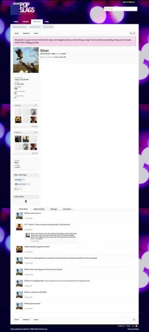
Hi Arty - i've tried your update, but the user profile still seems to be broken. See screen grab and image below:
http://wearepopslags.com/forum/members/silvan.1/
Am I looking at some cached version by any chance?

http://wearepopslags.com/forum/members/silvan.1/
Am I looking at some cached version by any chance?

looks much better for my site 
Little iPad problem. Look at the screenshot

As you can see the top leftmost menu (Inbox, etc) is overlayed on the second row of the menu and it's not visible at all. Any suggestion on how to fix it?
I've added some menues in the menu bar so maybe there's no place for that menu. If you have any suggestion on how to place that menues I'll appreciate...
Similar threads
- Replies
- 5
- Views
- 557
- Replies
- 15
- Views
- 4K