Carlos
Well-known member
Blonde Moment you say? *gives a soft kiss*Removed #blondemoment thinking of something else.
Blonde Moment you say? *gives a soft kiss*Removed #blondemoment thinking of something else.
I have exactly the opposite problem! In my opinion, the most intuitive way to use any forum is to log-on and immediately click the "What's New?" link (or equivalent), so you can review all new posts since your last visit, regardless of where they have been posted.
However, I frequently get people complaining if I move (for example) a computing thread from General Chat to the Computing node, saying "I put it in General as I never go in Computing cos it doesn't interest me - can you put it back?" or similar! So it seems my users do know how to click a category; I just wish they would use "Whats New?" and get stuck into everything, rather than just assuming stuff posted in categories they usually aren't interested in isn't for them!
It's the best of the bunch.I actually find all of that design pleasing for the eye.
Carlos, I've endured your kissing of Shelley long enough man.*gives a soft kiss*
Well, I like her.Carlos, I've endured your kissing of Shelley long enough man.
I think you have to hold off on the kissing ... let's say ... until she kisses you back.
Too much kissing makes Carlos ... a Rico Suave !
RRRRRiiiiiiCOOOOOOOOO !


http://xenforo.com/community/recent-activity/ive always wondered why the xf 'forumhome' doesnt exploit the social aspect of xf. something more like a hybrid timeline/recent activity/ispy. something that relates more to the people you follow, what they say, what they are doing, and so on, with an option to navigate to (or even default to) the stale 1990's forumhome.
What bothers me is the recent activity page and the news feed page. They are essentially the same thing but with different looks to it. On top of that, it can be condensed into 1 page and have a filter instead. Multiple filters would be nice...to see the people you follow's posts, threads, status updates, likes, etc. I think those pages are being underutilized, especially since we do have a "follow" feature. Most of my members don't even know either of those pages exist. They request it and then I point it out and they are like "Oh...".A little unrelated but something that has irritated me greatly recently is that visitorpanel in pages where it doesn't need to be displayed in. I know I'm viewing I don't need to be shown it.
http://xenforo.com/community/recent-activity/
Coversations/pm area
http://xenforo.com/community/members/
http://xenforo.com/community/online/
http://xenforo.com/community/members/
Excellent example.Interesting design there!But I think that's a little too big. I would rather this one.

Excellent example.
I like it too.
Depending on the needs of the forum, you might want smaller or larger forum display items.
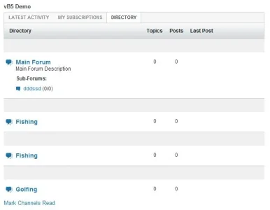
Here is a forum home I don't like.
View attachment 34279
I noticed that yesterday, too. Clicking "Forum" takes you there. Absolutely Annoying!Here is a forum home I don't like.
View attachment 34279
Indeed. I wonder how much bounced rate it would be with vB5 like that. I'm guessing 100%.Talk about getting the member lost beyond belief...
-snip-
aka, this page.
http://xenforo.com/community/ It's so long and boring. It's not a Xenforo thing. It's all forums. Every one of them. What does your look like ? Did you mod it ? Surely something better could be done ?
We use essential cookies to make this site work, and optional cookies to enhance your experience.