You are using an out of date browser. It may not display this or other websites correctly.
You should upgrade or use an alternative browser.
You should upgrade or use an alternative browser.
Implemented Push notifications need a modal prompt
- Thread starter Ozzy47
- Start date
This suggestion has been implemented. Votes are no longer accepted.
I would suggest, with the help of a notice (or notice-like UI) educate users and must not display it once the user dismisses it explicitly, while they can always go to their notifications settings to enable or disable the feature.
Yes, PUSH is awesome functionality. It should not be hidden away in the account settings. Only people that know its there will go look for it.
KISS would be to display a modal prompt to activate PUSH.
@ozzy47 please consider to add this to your suggestion. I dont thnk its the best approach to just show a notice to go look in preferences. IMHO its better to let users activate it right away like most sites do. One click actions are best.
KISS would be to display a modal prompt to activate PUSH.
@ozzy47 please consider to add this to your suggestion. I dont thnk its the best approach to just show a notice to go look in preferences. IMHO its better to let users activate it right away like most sites do. One click actions are best.
You could save yourself some shift/caps lock presses if you just call it “push” instead of “PUSH”. After all, it is not an acronym.Yes, PUSH is awesome functionality. It should not be hidden away in the account settings. Only people that know its there will go look for it.
KISS would be to display a modal prompt to activate PUSH.
@ozzy47 please consider to add this to your suggestion. I dont thnk its the best approach to just show a notice to go look in preferences. IMHO its better to let users activate it right away like most sites do. One click actions are best.
I was thinking the same... I can't understand if push notifications are actually enabled or not in here untill manually I went to preferences.
Is there a criteria so we can display a popup notification with a direct link that enables them? Better if there will be a dedicated icon like the onesignal one.
Is there a criteria so we can display a popup notification with a direct link that enables them? Better if there will be a dedicated icon like the onesignal one.
The problem with a notice is that, once dismissed, it doesn't appear again. Push notifications need a prompt on every device that you use as you need to enable them on each one, it's not an enable once for all devices thing. So really a proper modal prompt like you get from Facebook and other sites is required, otherwise users would likely forget (or be unaware of) the need to enable push notifications on each device.I would suggest, with the help of a notice (or notice-like UI) educate users and must not display it once the user dismisses it explicitly, while they can always go to their notifications settings to enable or disable the feature.
KISS would be to display a modal prompt to activate PUSH
Only issue I have with that is the length the modal could get with a bunch of addons that have alerts tied to them. It would already be too long with XFMG and XFRM on here.
Sites tend to ask you after you register to enable push notifications, xF can do the same.
The modal prompt would do just that (as well as all members).
You could save yourself some shift/caps lock presses if you just call it “push” instead of “PUSH”. After all, it is not an acronym.
He’s actually shouting it out loud in his head every time he does that, hence the caps.
You could save yourself some shift/caps lock presses if you just call it “push” instead of “PUSH”. After all, it is not an acronym.
I suggest to have no settings on the modal. Just this:Only issue I have with that is the length the modal could get with a bunch of addons that have alerts tied to them. It would already be too long with XFMG and XFRM on here.
Activate Push notifications:
Allow | Deny
100% agreeI suggest to have no settings on the modal. Just this:
Activate Push notifications:
Allow | Deny
For anyone unfamiliar with OneSignal. @Pierce 's XF1 implementation allows you to have a floating bell where you can easily switch them off an on on a per browser install basis.
I have it in the bottom left hand corner of the desktop browser screen

On hover:

On click:
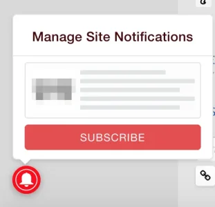
On subscribing:


Once subscribed, the bell is still there to easily unsubscribe that browser instance if you wish:
On hover you get the current status:

On click:
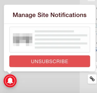
On unsubscribing:

Leaving the bell there in case you want to sub again in the future.
Something similar to this could be an option, with an additional link from the bell menu bringing you to the settings page to manually finely adjust the push settings.
I have it in the bottom left hand corner of the desktop browser screen

On hover:

On click:

On subscribing:
- If it's the first time subcribing, you'll get the browser permission request box.
- After confirming the browser permission, a temporary confirmation appears by the bell that hides within a few seconds.

- Plus a confirmation notification:

Once subscribed, the bell is still there to easily unsubscribe that browser instance if you wish:
On hover you get the current status:

On click:

On unsubscribing:

Leaving the bell there in case you want to sub again in the future.
Something similar to this could be an option, with an additional link from the bell menu bringing you to the settings page to manually finely adjust the push settings.
For anyone unfamiliar with OneSignal. @Pierce 's XF1 implementation allows you to have a floating bell where you can easily switch them off an on on a per browser install basis.
I have it in the bottom left hand corner of the desktop browser screen
View attachment 187424
On hover:
View attachment 187425
On click:
View attachment 187426
On subscribing:
- If it's the first time subcribing, you'll get the browser permission request box.
View attachment 187429
- After confirming the browser permission, a temporary confirmation appears by the bell that hides within a few seconds.
View attachment 187428
- Plus a confirmation notification:
Once subscribed, the bell is still there to easily unsubscribe that browser instance if you wish:
On hover you get the current status:
View attachment 187430
On click:
View attachment 187431
On unsubscribing:
View attachment 187432
Leaving the bell there in case you want to sub again in the future.
Something similar to this could be an option, with an additional link from the bell menu bringing you to the settings page to manually finely adjust the push settings.
I use one signal in a number of other web apps and I know that bell, having a perpetual bell taking up real estate for a very specific action that is likely to be used once is terrible user experience.
I don't have any problem with it if it helps users to enable this feature and makes it easy for them to manage it without getting frustrated I think it's worth thinking about. It shrinks quite small to the corner of my screen and doesn't bother me at all.
Most users will not understand that push is a feature that only works on a per browser basis. So if they're on their home PC, their mobile, their work PC or another PC then many will not understand that subscribing once will not make it work for all their devices. Hence why it needs to be relatively easy and obvious to see if that browser has them enabled or not (by hovering over some kind of icon or getting a browser notice)
It may not be ideal, but it's probably better than having it hidden away in a menu for the user to find on their own. Or only having a single modal that appears once to a user and never again. Or having the browser just request permission without the user requesting it, so they don't know why a site is asking to send them notifications.
A feature like this needs to be easily accessible, relatively obvious, easy to check the status and adjustable.
Perhaps it can be placed in a better location, or more tightly aligned to the corner of the screen, better integrated with the site theme etc.
I never find it gets in my way though as it only appears on larger screens.
I guess there could be a built in setting that hides the 'bell' once the user is subscribed forcing them to go to the menu to adjust it and unsub.
Additionally there could be an option to let the user permanently dismiss it if they know they know don't want to subscribe at that point and it's really bothering them.
I'm not sure what the best answer is. I think there's needs to be some kind of balance between having a user just given a browser request at login/registration with no info (I think this is how Discourse does it, or did last year) and encouraging them/introducing them to the feature and allowing them to manage it.
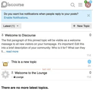
Edit: It looks like Discourse has a small notice at the top of the screen which you can use to enable, or dismiss

 meta.discourse.org
Most users will not understand that push is a feature that only works on a per browser basis. So if they're on their home PC, their mobile, their work PC or another PC then many will not understand that subscribing once will not make it work for all their devices. Hence why it needs to be relatively easy and obvious to see if that browser has them enabled or not (by hovering over some kind of icon or getting a browser notice)
It may not be ideal, but it's probably better than having it hidden away in a menu for the user to find on their own. Or only having a single modal that appears once to a user and never again. Or having the browser just request permission without the user requesting it, so they don't know why a site is asking to send them notifications.
A feature like this needs to be easily accessible, relatively obvious, easy to check the status and adjustable.
Perhaps it can be placed in a better location, or more tightly aligned to the corner of the screen, better integrated with the site theme etc.
I never find it gets in my way though as it only appears on larger screens.
I guess there could be a built in setting that hides the 'bell' once the user is subscribed forcing them to go to the menu to adjust it and unsub.
Additionally there could be an option to let the user permanently dismiss it if they know they know don't want to subscribe at that point and it's really bothering them.
I'm not sure what the best answer is. I think there's needs to be some kind of balance between having a user just given a browser request at login/registration with no info (I think this is how Discourse does it, or did last year) and encouraging them/introducing them to the feature and allowing them to manage it.
Edit: It looks like Discourse has a small notice at the top of the screen which you can use to enable, or dismiss

Android live notifications are now in core!
On mobile browsers that support it*, the live notifications feature is now available! To turn on notifications, navigate to your user preferences, and hit “enable notifications” just as you would on desktop. You will receive a confirmation notification if all went well. Admin options There...
 meta.discourse.org

Similar threads
- Question
- Replies
- 1
- Views
- 49
- Replies
- 1
- Views
- 30
- Suggestion
- Replies
- 4
- Views
- 483
- Question
- Replies
- 4
- Views
- 1K
- Question
- Replies
- 6
- Views
- 456
